Google Analytics is a tool that can provide invaluable insights into what’s happening on your website, your levels of traffic and engagement, and the success of your campaigns. If you’re a newcomer to Google Analytics, however, the array of different reports available to you can be a little overwhelming. Where should you begin? Where can you find the most useful data about your website? Google Analytics standard reports are the preset reports listed down the left-hand side of your dashboard, divided into the segments Real-Time, Audience, Acquisition, Behavior and Conversions. The information that appears in these is preset by Google Analytics, and gives an insight into the data on every part of your site, from your audience demographics to the channels through which they find your website. In this series, we’ve set out to tackle the ambitious task of explaining each segment of Google Analytics and the standard reports they contain. Last time, we looked at Real-Time Reports and how they can be used in your marketing and SEO campaigns. In this instalment, we’re going to look at Audience Reports: what you can learn from them, and how you can get the most out of the data that they offer.
What are Audience Reports?
As with Real-Time Reports, the secret to what these reports do is in the name: they tell you more about your audience, the people who are coming to your site. The Audience section of Google Analytics is an extensive one, with no fewer than fifteen sub-sections sitting within it, most of those with several different reports. We won’t cover each one in exhaustive detail in this guide, but will give a quick whistle-stop tour of the main sections and look at some ways that you can use these reports to maximum effect in your marketing campaigns.

Overview
The Overview section shows you your website’s current audience at a glance. It’s not in real-time – you need Real-Time Reports for that – but nevertheless presents a useful snapshot of the current audience metrics on your site, with information on users, unique users, sessions, page views, bounce rate and more. The default time period is set to a week, but you can use the calendar drop-down in the top right corner to adjust it and view metrics over a longer or shorter period. You can also use the buttons just below that to view hour-by-hour, day-by-day, week-by-week or month-by-month stats (note that the last two of these will only work if the time span you’ve selected is more than a week/month).
Active Users
This report gives you an insight into the number of unique users who have visited your site over various time periods – 1 day, 7 days, 14 days and 28 days. This report is most useful for understanding the success of a promotional campaign while it’s running. As Google’s Analytics Help text for the Active Users report advises:
“If the numbers are consistently in line with your expectations, you’ve found your sweet spot. “If the numbers are below expectations, reevaluate your marketing efforts to see whether you’re targeting the appropriate audiences, and whether your ads are winning auctions. “In cases where you have a lot of 1-Day Active Users but the numbers drop off for longer term users, that can signal things like problems with a new release, or that initial enthusiasm isn’t translating into long-term engagement. For example, lots of users might be downloading an app but are finding that it doesn’t really meet a need they have or that it doesn’t capture their interest.”
Lifetime Value
The Lifetime Value report for Google Analytics was first tested in the first quarter of 2016 (as reported by Search Engine Roundtable at the time) and was rolled out fully in early 2017, although as I write this, the report is still in beta. The report is geared towards Google Analytics users who have an ecommerce website, and is only available if you have activated ecommerce tracking on Google Analytics. The Lifetime Value report allows you to filter by the date on which a certain user was acquired, making it possible to analyze users acquired during the most recent day-long, week-long or month-long campaign. It also allows you to compare various different Lifetime Value (LTV) metrics, including:
- Appviews per user (applies only to mobile app users)
- Pageviews per user (applies only to website users)
- Goal completions per user
- Revenue per user
- Session duration per user
- Sessions per user
- Transactions per user
For a more in-depth examination of how these metrics are calculated, have a read of Optimize Smart’s ‘Measuring customers’ lifetime value in Google Analytics for mobile app and website users‘.
Cohort Analysis
A cohort of users is any group of users that is segmented based on a date. For example, a cohort could be a group of users with the same acquisition date (technically in GA this would be the Date of First Session), or a group of users who completed their first transaction during a specific time period. To configure a cohort report, there are four main selections you need to make: Cohort type: This is the date that you want to base your cohort on. A little frustratingly, GA currently only gives one option for this section – Acquisition Date. However, it is possible to use report segmentation to get some additional insights, such as segmenting by traffic source or campaign. Cohort size: This is the time window that you want to use for your cohort type: e.g. by day, by week, by month. Metric: This is the actual data you will see presented in the report. You can choose from aggregated metrics such as pageviews or revenue, or per-user metrics such as sessions per user or transactions per user. Date range: This is the date range used to construct the cohort; you can choose from the last 7 days, last 14 days, last 21 days or last 30 days.
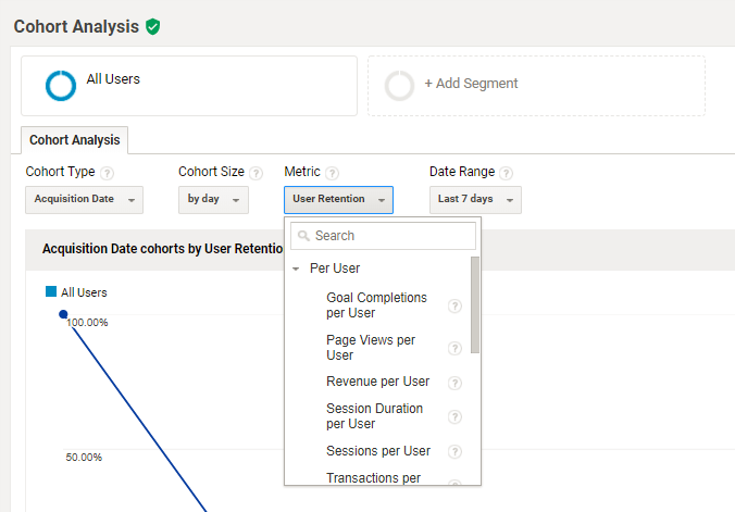
For a much more detailed guide to using cohorts in Google Analytics, check out ‘Understanding the Google Analytics cohort report‘ by Analytics Talk.
Audiences
To populate this report with data, you first need to define an audience within Analytics. To do that, you should enable Demographics and Interests reports, then create an audience. You can use one of the preconfigured audiences available within Analytics, or create one from scratch. An audience might be as general as “current shoppers” (including users who have >0 product views, and excluding those who have >0 purchases) or as specific as users who have viewed the detailed page for [Product x], and then returned within 7 days to purchase. Finally, publish your audience to Analytics by adding Analytics as a destination for that audience. The Audiences report will display data for your audience(s) from the point at which you create the report onwards – it isn’t available retroactively. Once this is all set up, you can view Acquisition, Behavior and Conversions metrics for the audiences you have defined, and respond to their performance with actions like:
- Devoting more of your marketing budget to bidding on ads for those users
- Expanding on the hours during which you bid on ads shown to those users
- Expanding the number of sites on which you bid for ads shown to those users.
User Explorer
To populate this report with data, you need to first enable the User-ID feature in your property settings. Once set up, this report allows you to isolate and examine individual, rather than aggregate, user behavior. For each client or user ID, you can view the following initial data:
- Sessions
- Avg. Session Duration
- Bounce Rate
- Revenue
- Transactions
- Goal Conversion Rate
Then after drilling into the ID, you can see the acquisition date and channel for that user, along with an activity log detailing which actions that user took on your site during each session. You can use the Filter by menu to add and remove data types, and expand and collapse individual sessions as necessary. You can use the User Explorer report to more closely examine any noteworthy behavior that you spot within a particular segment, to get a more detailed understanding of what might be going on. By examining individual session behavior, you can also see when your users fall short of completing certain goals, and remarket to those users with specific information related to their experiences. Additionally, you can personalize your customer service and offer informed guidance based on the context provided by the User Explore report. Just remember to tread the line between “helpful” and “creepy”!
Demographics
The Demographics section in Google Analytics gives an insight into the age and gender of your website audience, and how different age and gender groups behave differently on your site. Google cautions that, “Demographics and interests data may only be available for a subset of your users, and may not represent the overall composition of your traffic” – so bear in mind that this data may not be present for the whole of your audience, depending on whether or not it can track them via a DoubleClick cookie or Device Advertising ID. The Overview report shows you the age and gender breakdown of your audience at a glance, with age divided into 18-24, 25-34, 35-44, 45-54, 55-64 and 65+ bands. In the top right corner of each graph, you can see which percentage of users on the site this data represents. The Age report gives a breakdown of how those different groups interact with your website – their average bounce rate, pages per session, session duration, and completion rate of any goals and conversions you’ve set – and the Gender report does the same for gender. The graph at the top of the report allows you to view how many of each type of user accessed your site on any given day – so if you’ve been executing campaigns to drive a specific demographic (e.g. women aged 18-24) to your website, you can assess how successful that has been over time.
Interests
They say psychographic data, rather than demographic data, is where it’s at these days. If so, the Interests section of GA Audience Reports is where you’ll find your most valuable information. Google uses a variety of data points taken from places like Gmail, app messages, internet browsing habits and YouTube history to make a guess at each user’s personal interests. GA splits up interest data into three categories, each with its own report: Affinity, In-Market and Other. Affinity Categories: Users who have a general interest in the topic in question – Google describes the interest level of these users as “Lifestyles similar to TV audiences, for example: Technophiles, Sports Fans, and Cooking Enthusiasts”. In-Market Segments: Users who have “product-purchase interests” in the topic in question, akin to a buyer who is at the bottom of a purchase funnel and ready to convert. Other Categories: This category provides the most granular view of your users’ interests. For example, says Google, “Affinity Categories includes Foodies, while Other Categories includes Recipes/Cuisines/East Asian”. These reports display similar data to the Demographics reports, with users segmented by interest area instead of by age group or gender. So what is interest data good for? If you’re an advertiser, you can use it to more effectively target ads based on specific interests. If you’re a publisher or otherwise publish content marketing to your site, you can get ideas for content topics based on what your users are most interested in. You can also segment your report to get an insight into how these interest categories align with other demographics or behaviors. For example, below I’ve segmented the Other report by the 18-24 age group, revealing which interests are most prevalent among the youngest age group on Search Engine Watch.
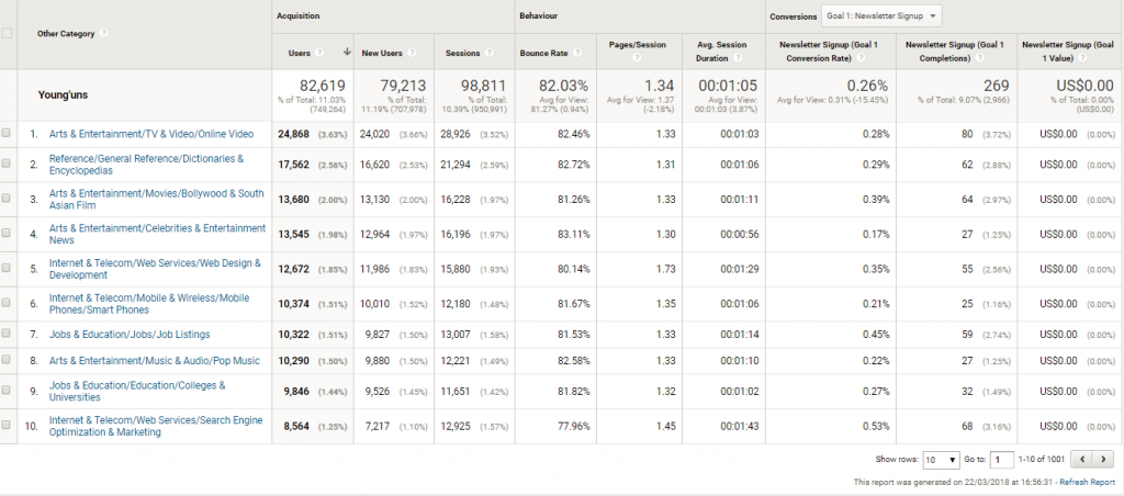
Apparently SEW’s younger readers are more into Bollywood than SEO…
Geo
The Geo section contains reports on the language and location of your website visitors. In the Language report, you can view Acquisition, Behavior and Conversions for site users who speak different languages – particularly useful if you run an international business, or have been thinking about diversifying into international markets, as you can get an idea of which language markets it would be most worthwhile expanding into. The Location report features a virtual map of your users’ locations, which is useful for targeting search and social ads. You can zoom in on data at the city level, which allows local businesses to know if their marketing efforts are driving traffic and conversions from the right regions, and is also useful for publishers who want to create locally-focused content.
Behavior
The Behavior section allows you to break down your audience by how often they visit your site, and the duration of that visit. You can learn how many times on average a visitor comes to your website, how many days tend to elapse between sessions for repeat visitors, how long visitors remain on your site and how many pages they visit whilst there. If you’re a publisher, this is valuable data on how ‘sticky’ your website is and how successfully you’re managing to retain visitors. If you’re aiming to create more engaging content, you can track these metrics to gauge the success of your efforts, keeping an eye out for an increase in returning visitors or the duration of an average visit. If you’re in ecommerce or sales, you can use this data in conjunction with Goals in order to learn what visitor behavior typically leads to a conversion. Do you score the most conversions on the user’s first visit, or on subsequent visits? If the latter, what can you do to make your visitors more likely to return and convert?
Technology
The Technology section of GA Audience reports reveals which browsers, operating systems and even network providers your audience is using to access your site. This information can be useful if your business creates online extensions, software or applications, and you want to know which browsers and operating systems to make them compatible with. You can also use it to work out where you should be allocating your technical resources – if only a small fraction of your audience uses Opera, for example, it’s probably not worth putting a lot of time and effort into making sure that your website is optimized for that browser.
Mobile
If you’ve been in two minds about whether to optimize for mobile (though by now we hope we’ve persuaded you that it is worthwhile!) or want the data to back up an argument for a mobile site/app, head to Google Analytics’ Audience => Mobile section. In the Overview report you can see Acquisition, Behavior and Conversions data for desktop, mobile and tablet users – which can also allow you to learn, for example, if your bounce rate is significantly higher on mobile (which might indicate a poor mobile experience) or whether more users are completing purchases on a desktop device. The Devices report then provides you with incredibly specific insights into the devices your audience is using to access your website, down to the make and model of the device. If you’re developing a mobile app and are unsure about whether to produce it for Apple or Android, or want to test your mobile site using the most common devices wielded by your users, this is the report to look at.
Custom
In this section, you can create a custom Audience report using your own chosen variables, metrics and dimensions. As the scope of this series is standard Google Analytics reports (not custom), I won’t go into detail here about how to get the most out of this report, but Econsultancy has a solid beginner’s guide to creating a custom report in Google Analytics if you want to get to grips with the basics.
Benchmarking
Benchmarking reports are only available if you have benchmarking enabled on Google Analytics, but once you do, it gives an extremely useful insight into how your website audience and performance compare with other companies in your industry. Google allows you to get extremely granular with the industry categories, providing a list of more than 1,600 to choose from. You can further refine the data by geographic location and traffic volume, allowing you to compare like for like with other websites of the same size and location.
Users Flow
The Users Flow report is a fairly unique-looking report that doesn’t immediately resemble any of the other standard reports in Google Analytics. As the name implies, it is useful for studying and trying to understand the “flow” of users through your website – the path that they typically take from page to page. It also highlights where users drop off – so you can isolate where exactly users might be getting stuck or losing interest, and take steps to remedy it. A drop-down menu in the top left allows you to view user flow by location, language, browser, mobile device, and other custom data dimensions. This view can be particularly useful for ecommerce marketers to understand the path that users typically take to conversion, as well as for publishers seeking to understand which articles bring the most users to the site, and where users typically navigate after reading them. How do you make use of Google Analytics’ many different Audience Reports? Do you have any novel applications to share? Leave a comment, and stay tuned for our next instalment on Acquisition Reports!


Leave a Reply
You must be logged in to post a comment.