As all business owners who operate an ecommerce website know, it can take a while to hit full stride in terms of conversion rate.
When results are underwhelming, the first instinct might be to make big changes across the board.
What a lot companies fail to realize is that a great deal of buying decisions take place subconsciously. Design errors can seem minuscule, but have a huge impact on the bottom line.
It’s very possible there are a number of UX flaws in your layout that are turning visitors off at first glance. Here are a few things you may have overlooked in your approach.
1. Lack of visual hierarchy
Web design is about so much more than just making a platform look pretty and appealing. The bulk of the process is about adhering to goal-based functionality. Using visual elements such as color, positioning, contrast, shape, size, etc. you can strategically organize the page so users get a strong impression of how important certain components are. Basically, it’s about where you want your customers’ eyes to be drawn to.
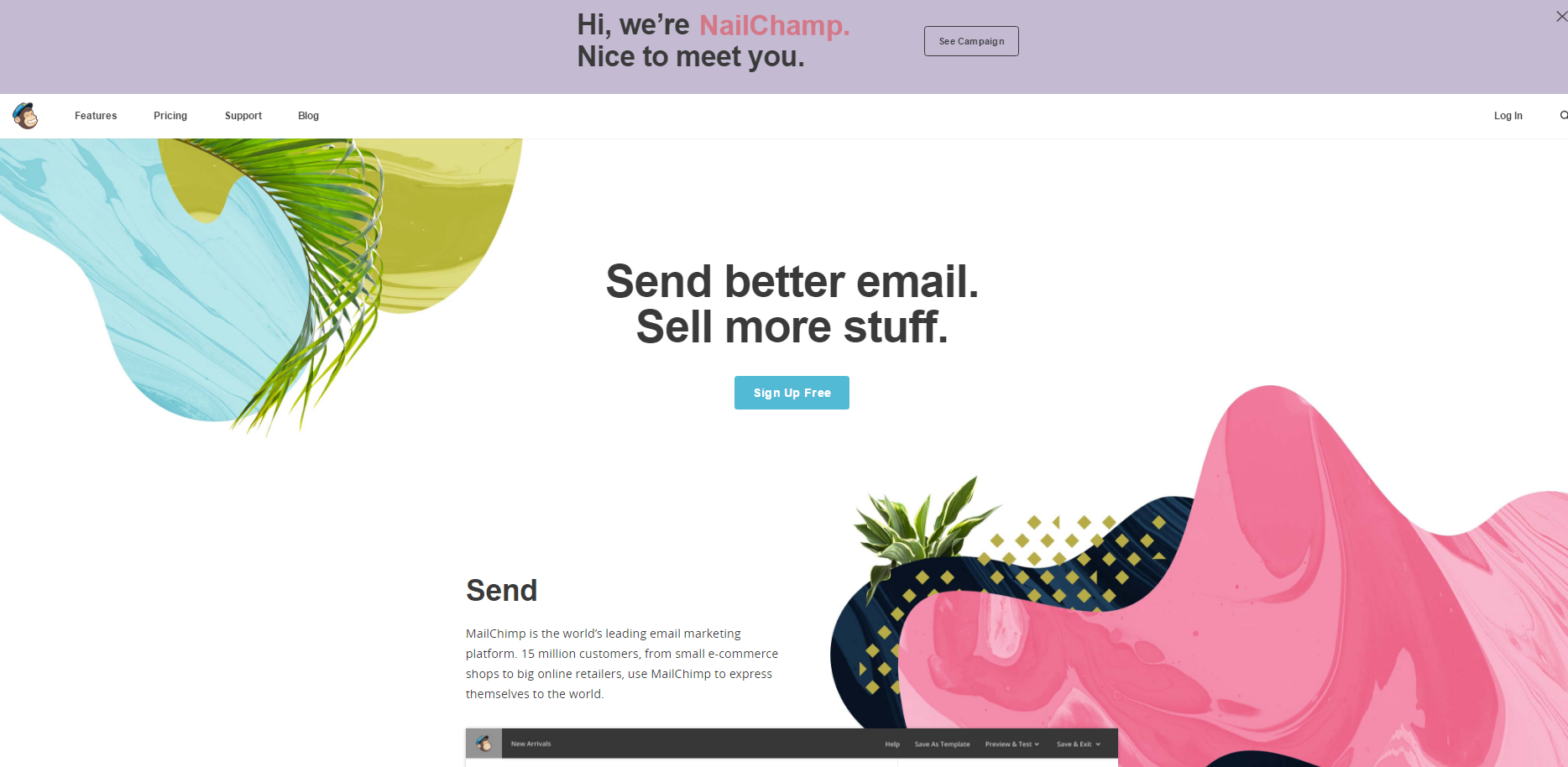
Here is MailChimp’s homepage:

Where is the first place your eyes went? Chances are, they went to the CTA in the center of the page. The button they’ve use is slightly offset from the rest of the color scheme and the message sticks out very prominently.
Based on the goals of your landing page, the desired action should be properly conveyed on the visual hierarchy scale and jump out to the visitor.
TechWyse did a case study on how certain landing pages attract attention. Here is the original landing page they used in the experiment:

Now, here is the landing page with a heat map of where visitors’ eyes were being drawn to:
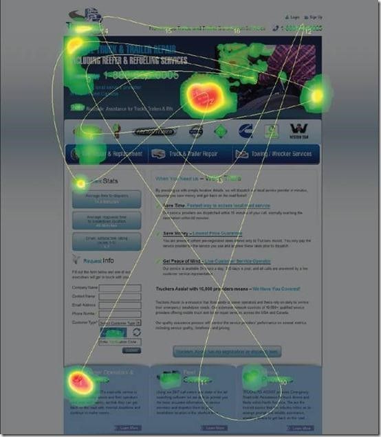
You’ll notice that the place with the highest engagement was the vivid red “NO FEES” sticker. The problem with this is that it draws eyes, but has no click action or conversion related goal. Therefore, visitors are being diverted from the more important parts of the page.
A tool such as Zarget will help you identify the reading and scanning patterns of visitors to your site. It can also track browser interaction with moving and dynamic elements, as opposed to heat maps based on just snapshots (like the ones Crazy Egg gives you).
When you are designing landing pages, keep in mind your overarching objective for conversion. Is it to gain sign-ups? Promote a deal? Whichever you decide, be sure your visual hierarchy invokes the desired action and navigates users to a conversion.
2. Unclear value proposition
Keep in mind, not everyone wants to be sold to immediately. Showcasing your unique selling proposition right off the bat is a good way to entice visitors to see what you have to offer.
Your value proposition is what tells customers why they should choose you as opposed to the competitors. Regardless of what you sell, this needs to be apparent almost instantly. The widespread usage of Amazon makes this concept extremely vital to the setup of ecommerce websites. Why should a customer buy from you instead of the convenient retail giants?
The harsh truth of the matter is that a lot of online businesses struggle with clearly communicating their value proposition. Follow these steps when crafting yours:
- Identify the need – The most important thing to convey is that you understand the customer’s primary need. The value proposition should start by recapping it.
- Present the solution – This is where you need to highlight the main benefits of your service.
- Show differentiation – This part requires a bit of finesse. Simply bashing a competitor is not the solution here. Instead, subtly address the common objections customers have within the industry and your unique way of solving them.
- Provide proof – Lastly, it’s safe to assume that most customers will be skeptical of your brand messaging. With this in mind, it is always a smart move to validate your claims with proven recognition. Testimonials, case studies, and success stories are a great place to start.
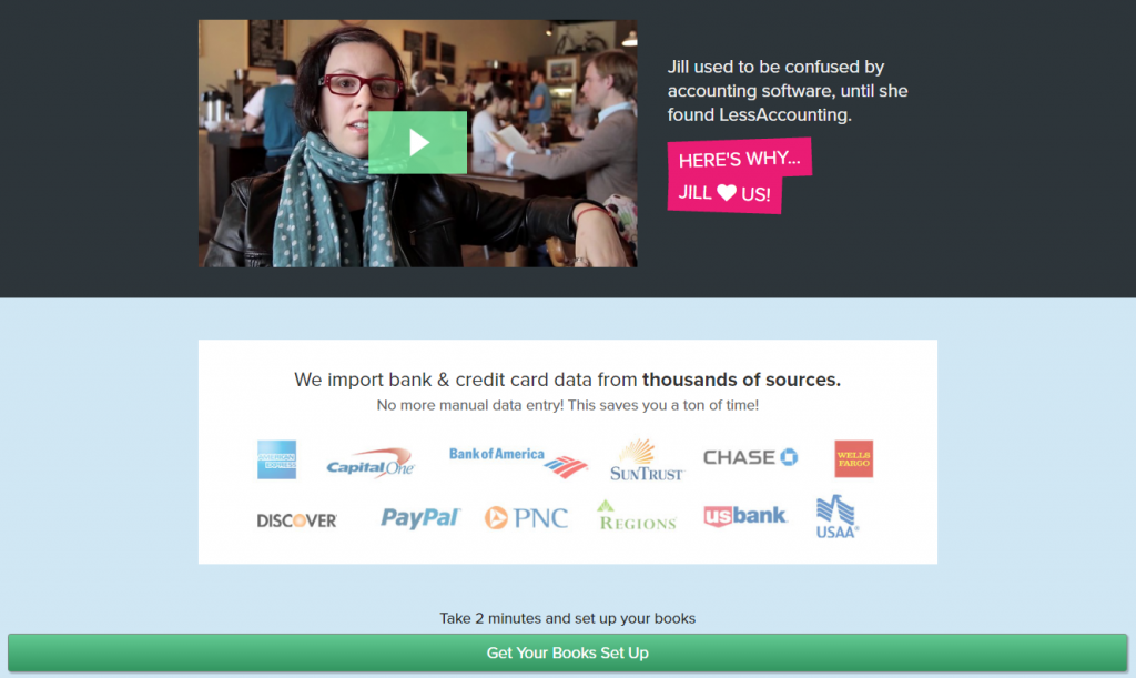
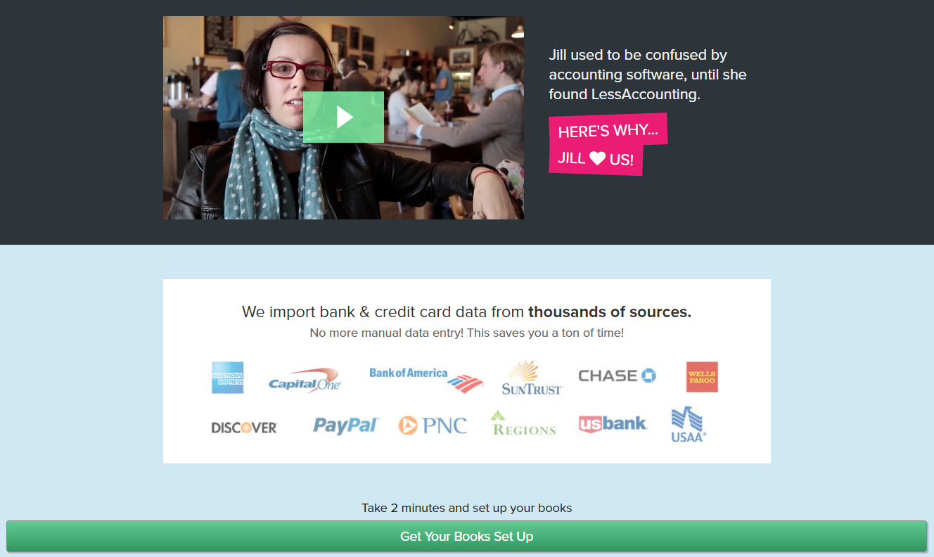
Here is a great example from Less Accounting:
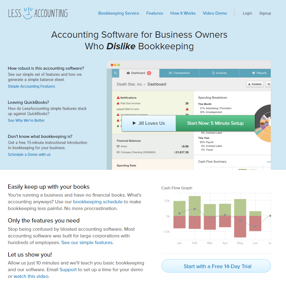
Their entire homepage is devoted to expressing their value proposition. They take a common issue of the industry and spell out how they work to solve the problem. Below the fold, they show a video success story as well as the big name companies their platform is compatible with for validation.
A series of case studies conducted by Invesp found that a well-crafted value proposition can increase your conversion rates by 90 percent! In the vastly overpopulated ecommerce landscape, customers have no problem moving on to the next brand if your value proposition is murky.
3. Subpar checkout process
The checkout process is perhaps the most crucial piece of the ecommerce puzzle. Given that the average cart abandonment rate was 76.8 percent last year, it can be a very complicated design element to master. There is a plethora of reasons why people choose to abandon their carts:

Basically, your goal should be to eliminate as many hoops as possible that the customer has to jump through in order to buy. Each step means another chance to reconsider. Simplicity is very important here.
Now, having 1-click checkout options like Amazon may not be viable for all ecommerce platforms. But, there are many little design tweaks you can make and elements to add that will make the process easier.
First of all, there should always be a function where the customer has the option to checkout as a guest. Most people know that registering for a website means they will be bombarded with spam.
Also, be sure it’s very obvious what is in the shopping cart, as well as the total cost with all fees included. Here is an example of a cart from Asos:
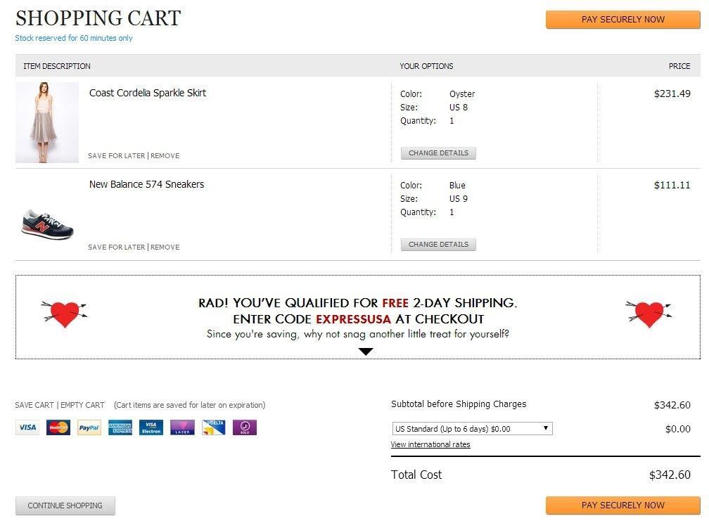
They clearly show the total cost of the items and provide options for shipping so the user will not be hit with any unexpected extras.
Another great component to include is a progress indicator:

Adding this to your design will make the process seem more organized with a clear funnel to a conversion.
Everything you add to your ecommerce website ultimately leads to the checkout. If this section is poorly crafted, your conversion rate will suffer. Your choice of ecommerce platform will make all the difference – a customizable one like Shopify will ensure your shopping cart has the requisite functionality, without which the best design is meaningless.

So while you put the best shopping cart systems in place, implement all that advice out there on how to improve your checkout process, and keep an eye on your analytics all the time to see if you’re meeting your conversion goals, how much of those 76.8% abandoned carts can you actually expect to recover?
Neil Patel, co-founder of Crazy Egg, Hello Bar, and KISSmetrics, estimated the recovery rate at 10-30% in an article for Forbes. “The amount of sales that you can recover with rates like that really adds up,” he wrote.
4. Obsolete website theme
First impressions are everything in ecommerce. What is your first thought when you see this one?

If your website looks like it was designed back in the 90’s, consumers can easily jump to conclusions like a) you’re no longer in business, and b) your website won’t keep their valuable information secure. Both will cost you credibility and turn potential buyers away in droves.
Additionally, outdated websites do not typically fare well in the search rankings. Google updates their search algorithms hundreds of times a year, and values user experience over most other ranking factors. Rohan Ayyar, my fellow Search Engine Watch columnist and SEO guru, has this to say:
“It’s common knowledge that Google conducts frequent usability studies and scores of experiments to improve their own products. That’s how serious they are about UX. Your website will sink rapidly down the SERPs if you continue to ignore usability.”
Fixing your web design with a UX-first approach will require a bit of market research. Take a look at your competitor’s websites to get an impression of what is par for the course. Also, be sure you are keeping up with the latest trends in web design.
For example, simplistic homepages that do away with text heavy content are being used more often these days to serve as a powerful introduction to a website. Here is Vera Wang’s homepage:
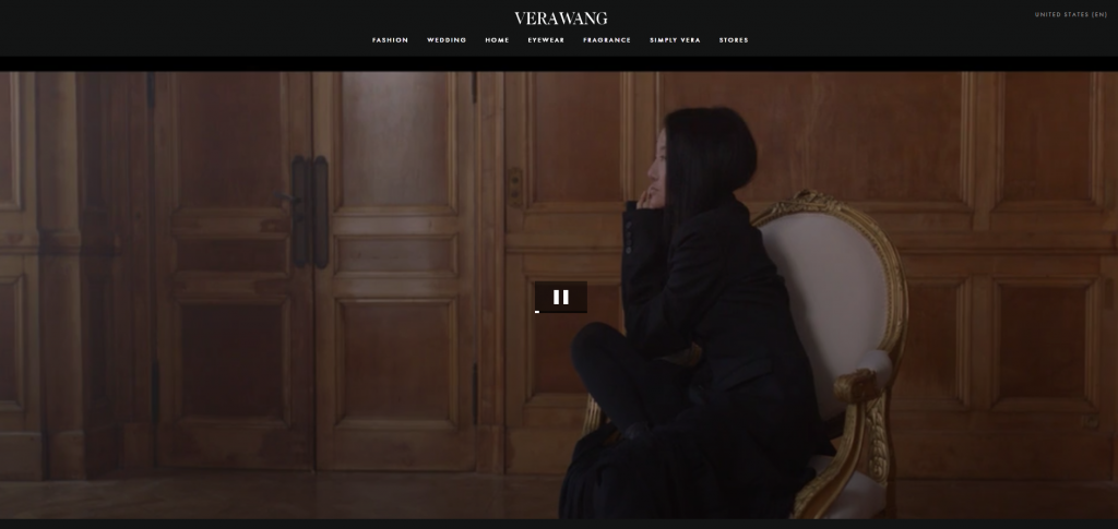
The main focus of the landing page is a captivating video used for the first impression, rather than a wall of text leading to product listings.
Ultimately, if your website appears outdated, you are leaving money on the table. No matter how great your content is, visitors will be turned off at first glance. However, using conventional web design standards and practices doesn’t mean you have to conform to the latest design trends or adapt your layout to it.
Jeffrey Eisenberg, CEO of BuyerLegends.com, summed it up best when he advised webmasters to make their sites focus on “persuasion” instead of “conversion”:
“The ability to achieve truly dramatic improvements in conversion rates still requires a shift in conventional thinking. Design teams need to understand that while the goal may be conversion, the practice must be persuasion.”
This implies designers, developers, content creators and marketers will soon wind up on the same page in the not-too-distant future. In fact, the tools to help them do that are already here.
For instance, UXPin helps business owners and marketers collaborate with their design teams to rapidly create wireframes and prototypes, from which the designers and developers can work towards a finished website that meets all the required functionality.

Over to you
Designing a website is not rocket science. However, finding the perfect balance of elements that result in a healthy conversion rate will likely take some experimentation. The key is to always be testing and optimizing.
Each ecommerce platform will require different formulas for conversions. Don’t fall prey to these common blunders.


Leave a Reply
You must be logged in to post a comment.