Google experiments with new desktop SERP layout
Google is once again experimenting with a card-based SERP for desktop, where each result is placed in its own separated box like you would normally see on a mobile search.
Google is once again experimenting with a card-based SERP for desktop, where each result is placed in its own separated box like you would normally see on a mobile search.
Yesterday, while indulging in my daily spot of ego-surfing very important research, I was surprised to find Google offering me a completely new layout.
It seems Google is once again experimenting with a card-based SERP for desktop, where each result is placed in its own separated box like you would normally see on a mobile search.
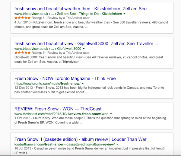
This is the search for an album review I recently published…

These cards appear all the way down the page…
Assuming this may just be a one-off, or specific to ‘reviews’, I then searched for my very favourite query…
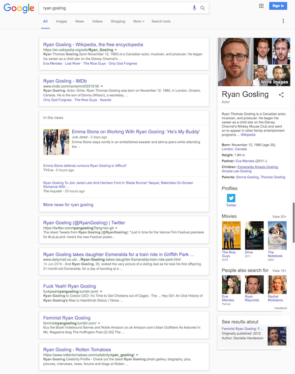
All the results are ‘carded’ once again, with News results given their own specific area.
I also tried a local search for ‘london steak restaurants’…
Not only are the results in card-form, but Google is showing a local three-pack here, rather than the two-pack its been experimenting with recently.
Just a few days ago, Google’s core algorithm experienced significant turbulence, which led many experts to believe a change is coming.
Google has also recently been testing another desktop UI variation, by increasing the spacing between results. According to The SEM Post the test gives a much cleaner look with more white space, but it also means that results get pushed further down the page.

However it should be noted that Google has experimented with this card-based layout before. Way back in 2013 it underwent testing, but shortly disappeared soon after. It then appeared again earlier this year in May.
Although neither test led to a roll-out, there’s clearly a reason why it keeps coming back. It does make for a cleaner SERP, with results feeling neater and better organised. And perhaps Google persists with the test because it would make its desktop and mobile UI consistent.
Maybe in a year’s time we’ll know the winner in the battle of ’more space’ vs. ‘cards’. Or maybe we’ll be staring at something completely different…
Personally my fingers are crossed for results appearing one-at-a-time on screen via increasingly elaborate star-wipes.
Leave a Reply
You must be logged in to post a comment.