Three technologies you absolutely must have for better SEO
Your website has to stay on trend to survive.
Your website has to stay on trend to survive.
Your website has to stay on trend to survive.
Fast page loads. User-friendliness. Instant access to favorite news sources and blogs. Security… These are the needs of the internet browsing population.
It happens every day. You’re walking the dog and reading the news on your phone at the same time or scrolling Facebook in the grocery checkout line or simply checking out some nerd blogs while the kids play at the park, and there it is – a slow, clunky website.
What do you do? You utter a few adjectives and move on to a website that isn’t afflicted with the same ailments. It might be less informative or entertaining, but hey, you can actually view it.
This should never happen to your website. Ever.
Search engine optimization is an ever-changing, fluid landscape. In the old days, there were only desktops, and everything was geared to suit them.
Then mobile phones came along. There was sharing via email and instant messaging. Then social media happened. There was an emphasis on link quantity (i.e. the more links you had pointing to your website, the better your ranking).
Then, spammers took advantage of it and link quality became more important. There were 10-pack business listings. Then, they dropped to 7-packs and ultimately to 3-packs.
Competition for internet real estate has gotten stiffer and the hoops a bit higher. Google, the leader in search engines, keeps improving their search technology and rolling out algorithm (formula applied to search results) changes.
For website owners, it’s imperative to stay on top of Google’s algorithm changes. Right now, there are three main website technologies that you absolutely must have.
Let’s start with cell phones and other mobile devices. In 2014, mobile users performed more internet searches than desktop users. Google knew it had to do something. Enter Mobilegeddon, the algorithm change that Google rolled out on April 22, 2015. It was considered the apocalypse of the internet.
Mobilegeddon promoted listings of mobile-friendly websites in the search results. Non-mobile-friendly sites were left out in the cold, which meant their rankings dropped.
So what does it mean to be friendly on mobile?
Google defines it this way. A website is mobile-friendly if:
Google applies these criteria to individual pages vs. websites, which is a benefit since optimized pages from your site can still rank even if the rest of your site doesn’t.
Being mobile-friendly is a minimum requirement and Google has a tool to determine if your website meets the requirements.
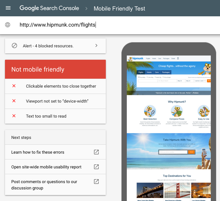
However, if you really want to make your website attractive to visitors, you should go a step further and make your site mobile-responsive.
Mobile-friendliness means that a site may have been designed for the desktop, but has been optimized to work on mobile devices. Mobile-responsiveness means that a site automatically responds to the device.
For example: a mobile-friendly site would show a desktop site on a smaller scale while a mobile-responsive site would show it in a different format, often in one column. A mobile-friendly site may not be mobile-responsive, but a mobile-responsive site will definitely be mobile-friendly.
Imagine a world where hackers could never hack your website. That world might be possible now with HTTPS, a security protocol that used to be used mainly for financial sites, payment portals, email, and sensitive transactions.

But the rest of the cyber world looked on and wanted secure encryption too. This is where regular sites began to adopt HTTPS (Hypertext Transfer Protocol Secure). The secure sockets layer (SSL) encrypts data on its way into your site and on its way out. Data is sent to and from a secure web server.
This protocol protects site visitors and owners from online eavesdropping, which is how hackers get credit card numbers and other sensitive information, or forging, which is what hackers do with the data they get.
And now, imagine a world where web pages loaded instantly. Google and a bunch of other technology companies and publishers imagined it. They put their heads together and created the AMP (Accelerated Mobile Pages) project, which is an open-source HTML project dedicated to fast and furious page loads.
What does this mean for you?
It means that you can put AMP code on your web page or post and deliver instant page results. So when your site visitor is at the grocery store and they’re trying to look at your blog about the clean 15, it won’t take five minutes for your site to load. That list of chemical-free fruits and vegetables will be at the user’s fingertips, instantly. You’ve just made a happy customer.
Facebook has its own version of fast content delivery, called Instant Articles. When content is uploaded to this Facebook publishing tool, the content is housed on Facebook and loaded instantly for viewers. Like Google’s AMP technology, Facebook Instant Articles are geared to mobile users.
To reach the goal of speedy page loads, AMP provides a plethora of web tools that create a common ground between websites that use it.
The AMP project leaders chose to make the software open-source so all platforms, developers, and publishers could collaborate to make the mobile web a faster and more pleasant experience.
AMP code works with photos, videos, and GIFs, in addition to written content. And AMP-optimized web articles will soon begin to appear throughout the organic mobile SERPs.
AMP technology also offers the option of caching. Third party platforms can access AMP content and cache it for their users. Google even provides its own Google AMP Cache, a free collection of AMP content that’s been published to the web.
WordPress developers already produced a WordPress AMP plugin. And many of the most prominent publishers and platforms, such as The New York Times, Pinterest, LinkedIn, and Mashable, are participating.
Of course, all of these features translate to faster page loads and longer engagement
Mobile web technology is the technology of the future. It’s imperative that website owners implement tools that are capable of delivering the kind of service that mobile users are looking for—fast, secure, and easy to navigate.
As Richard Gingras of Google states about the AMP project, “We wanna make the web great again.”
Leave a Reply
You must be logged in to post a comment.