

Google is testing a new layout for the Shopping ad results that appear in the Shopping tab. Previously, the product image sat at the top of the box, with the product name, price, website name, and reviews listed below it. Today I spotted two new versions of this layout.
In the new design, the image appears on the left side of the box and the content sits on the right. In the second version, the “Sponsored” tag appears below the image instead of above it.
Here is a screenshot of the new design.
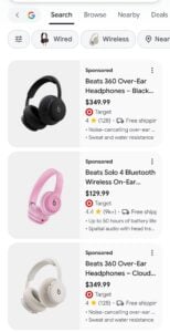
Here, the Sponsored ad label appears below the image.
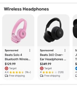
Here is a screenshot of the old design.
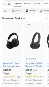
I only saw this on mobile, so this test may be limited to mobile for now. Personally, I like the new layout.
Start the conversation by posting the first comment