Seven ways to make your boring product page sizzle
I have some bad news: you are probably missing out on a lot of sales. Why? Because your product page is not effective enough.
I have some bad news: you are probably missing out on a lot of sales. Why? Because your product page is not effective enough.
I have some bad news: you’re probably missing out on a lot of sales. Why? Because your product page is not effective enough.
Boring product pages are pretty rampant with online storefronts that don’t have a billion-dollar corporate brand behind them.
Small to medium businesses, especially local brick and mortars with online shopping carts, are losing potential customers… not because of their products (which may be awesome) but because of the way they present them.
These seven tips will help you turn your dud of a product page into one that sizzles.
According to KISSMetrics, if your page takes more than three seconds to load, 40% of users will leave the website. Dead serious… three seconds!
That’s how important your landing page load time is. Here are a few easy ways to improve your site performance:
Besides telling you how important performance is, the importance of a fast-loading page tells you something else: customers react immediately to your site.
You should conduct a series of “First Impressions” tests. This is when you employ a handful of people to look at your site for a set number of seconds (no more than 10), and then ask for their first impressions.
This should include both a set of questions (What was your first impression of the design?; Would you buy the product on the page?; Would you go to other products on the site advertised on the page?; etc.), and space for them to write down what they thought.
Compare these impressions and you will start to get a very useful picture of what does and doesn’t work on your product pages.
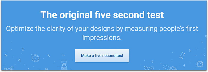
UsabilityHub is a good way to run a five-second test to see what your visitors’ first impression is when they land on your page.
Another option to try is TryMyUI which offers “impression testing”: the user is shown the landing page for about 15 seconds, and then answers four basic questions:
You don’t put a CTA on a product page in the same way that you would another website section. But that doesn’t mean you don’t have them.
A large, bright and impossible to miss shopping cart button that instructs people to put things into their cart is mandatory. It encourages them to do so, even when just browsing.
Other CTAs to include are sharing with friends, and getting emails on similar products in the future. If there is a promotion going on, be sure to add a pop-up or shopping cart notice about adding any other products to meet the requirements (i.e. “Add another $15 to your shopping cart to get free shipping on this order!”)
Abdullahi Muhammed, founder of Oxygenmat, has put together an awesome list on writing your product page copy which can get you inspired to create a catchy CTA (as well as improve your overall product descriptions).
Bannersnack is a great way to design your CTA button and matching banners. They have just launched their banner creator which is very easy to use!
Their online editor has got really advanced giving you free templates, stock images, varied templates and design ideas and even social media graphics.
This is a must for galleries now. You should have multiple images available for users to get an idea of what your products look like. But you should also give them the option of zooming in and taking a closer look to the details.
A good rule of thumb is to use multiple photos in different settings. Two should be a basic product stock image for each side, one should be the product being used by a model in the real world, and a useful one could be the dimensions placed against a drawn figure for scale.
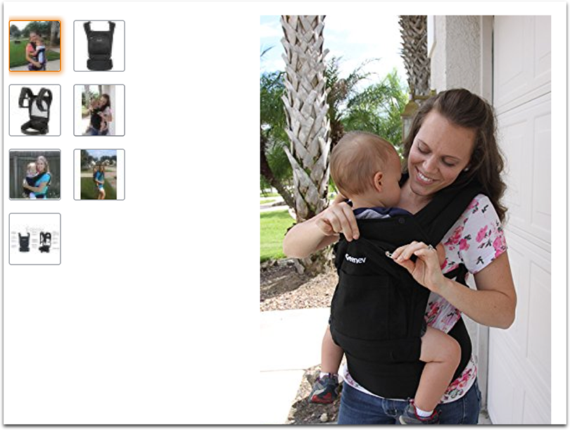
These images should be expanded for detail by giving a movable cursor box when you hover over each one.
You don’t want a ton of distractions getting in the way of your product. This is a mistake many big companies make when they design their pages. There is just too much there to take the focus away from what they are trying to sell.
Minimize the content on the page. Create tabs to hide product features, specs and reviews until the customer decides to read them. Keep your descriptions short and simple, with only the relevant information.
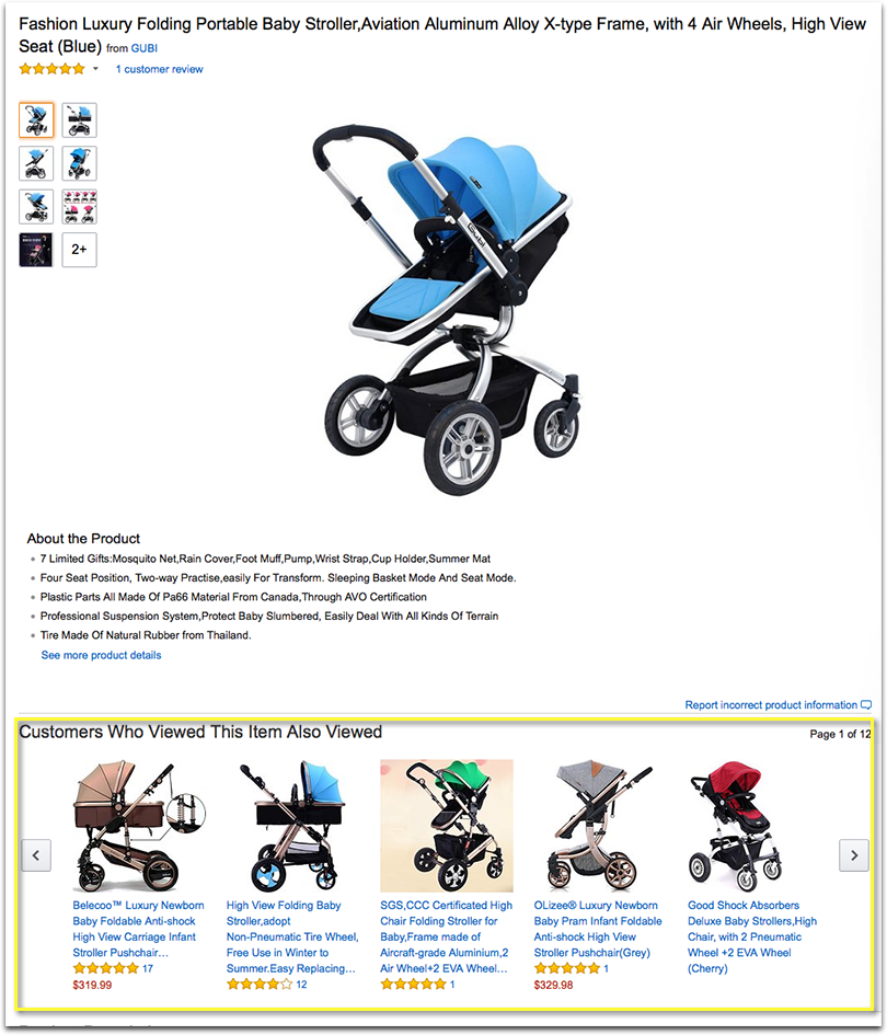
When you go to Amazon you will notice that recommended products are on the page, but under the details of the product. You don’t have to skim too far, but it isn’t seen immediately. That offers enough distance not to distract, while still encouraging connected products they may want to buy at the same time.
In a slideshow near the bottom of the product description is another list of products they might want to check out. All of this is useful, and presented in a way that doesn’t distract from the main product.
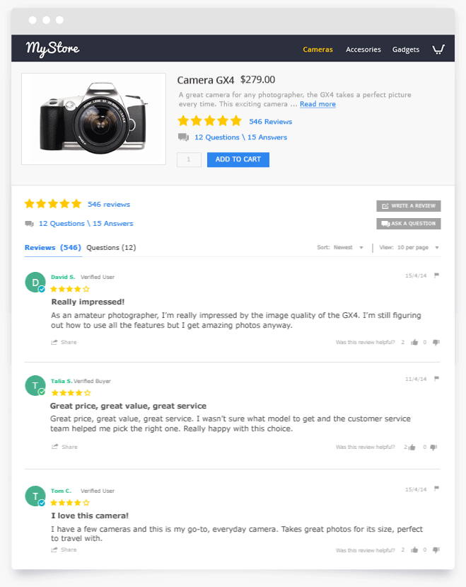
Customer ratings are important for most people when deciding whether or not to buy. You should keep your rankings front and center, but away from the primary product description. So near the title of the product you can have the star rank, with the number of reviews that have been written. It provides immediate context.
Yotpo is a great tool to collect and publicize those reviews. They make it easier for your customers leave their reviews, integrate that content into your site and make it each and fun share those reviews on social media for more exposure.
Just be sure the actual reviews are set away from the description, in their own tab. Sure, you could go with the Amazon design and have them listen on the bottom of the page. But that tends to look clunky and weaken the design as a whole. Having a section hidden until clicked is going to look better in most situations.
Making a hot, well designed product page isn’t difficult. It just needs some tweaking to follow by the tried and true layout.
Have some tips? Share them in the comments!
For more information on this topic, see our Ecommerce Checkout Best Practice Guide.
For more reports, including guides on mobile commerce, customer experience, and social customer service, head to ClickZ Intelligence.
Leave a Reply
You must be logged in to post a comment.