15 data visualisation tools to help you present ideas effectively
The number of digital skills you need in order to be a functional and useful member of your organisation are increasing at a rate you might be struggling to keep up with.
The number of digital skills you need in order to be a functional and useful member of your organisation are increasing at a rate you might be struggling to keep up with.
The number of digital skills you need in order to be a functional and useful member of your organisation are increasing at a rate you might be struggling to keep up with.
As well as the ability to understand your analytics and be fully aware of basic SEO skills, you need to be able to present information and data in the clearest manner possible to members of your team and, of course, your senior management.
Luckily you don’t have to be a graphic design wizard to achieve this.
Here is a list of various free and premium visualisation tools that will help you communicate your ideas in a variety of formats, for a range of different experience levels. Hopefully you’ll pick up some impressive new skills here too.
With Silk you can publish attractive looking webpages featuring a variety of different interactive visualisations, based on your data-sets. These can exist as standalone pages, linking back to your own site for a little SEO benefit, or you can embed them wherever you like.
Think of Sketch as a much easier to use, far more intuitive and BS-free version of Photoshop that’s also a damn sight cheaper. I’m including it here because after a recommendation from my learned friend Chris Lake, within the afternoon I had installed Sketch, messed around for a couple of hours and finished a fairly complex but crystal-clear multichannel content marketing plan. I love it.

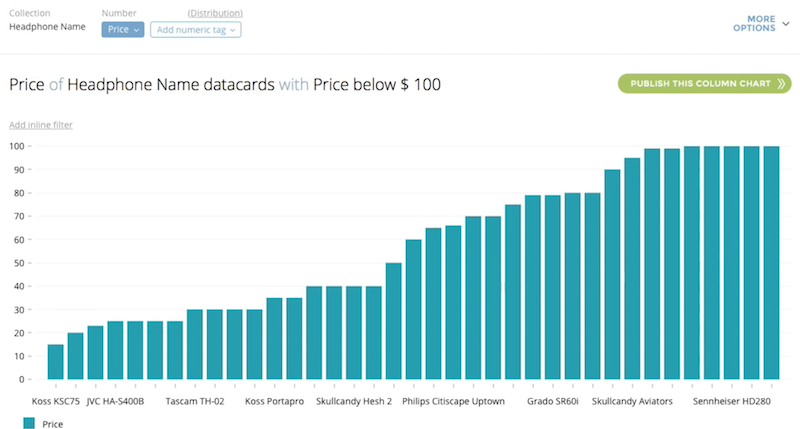
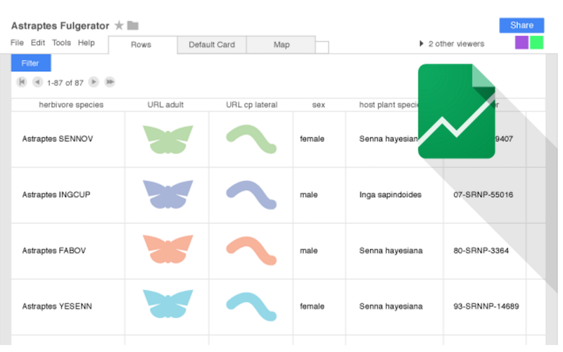
Fusion Tables is a web app that allows you to gather, visualize, and share data tables.
You can filter and summarize across thousands of rows, then adapt the data to an embeddable and shareable chart, map or custom layout. Plus all your data organization is automatically saved in Google Drive.
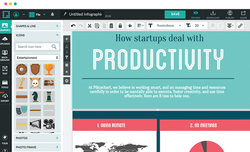
I’ve recommended Piktochart so many times – as has everyone else on the internet in the business of making your data-vizs and infographics look brilliant. It’s just so easy to use and the templates help you achieve results very quickly.
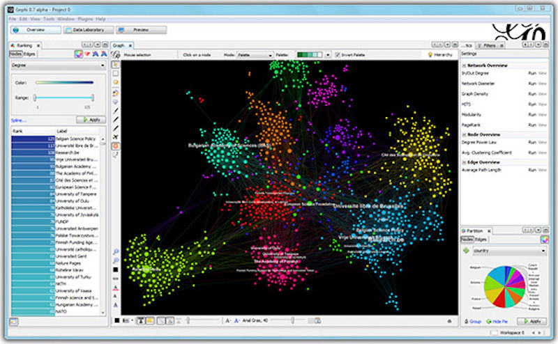
Gephi is an open-source data-viz tool for graphs and networks. It also allows for exploratory data, link and social analysis.
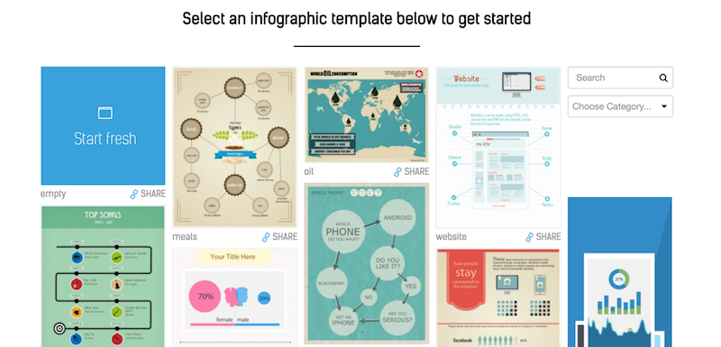
Easle.ly possibly has the most satisfyingly meta-textual name on this list. It also has 1,000s of infographic templates at your disposal, as well as the ability to create one from scratch.
Need a simple bar chart, line chart, venn diagram or graph rustled up in a flash, without any extra complicated bells and whistles? Hohli should have everything you need.
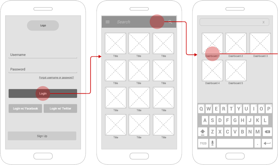
Gliffy allows you to make great looking flowcharts and diagrams, but its secret weapon is the fact it has collaboration at its core.
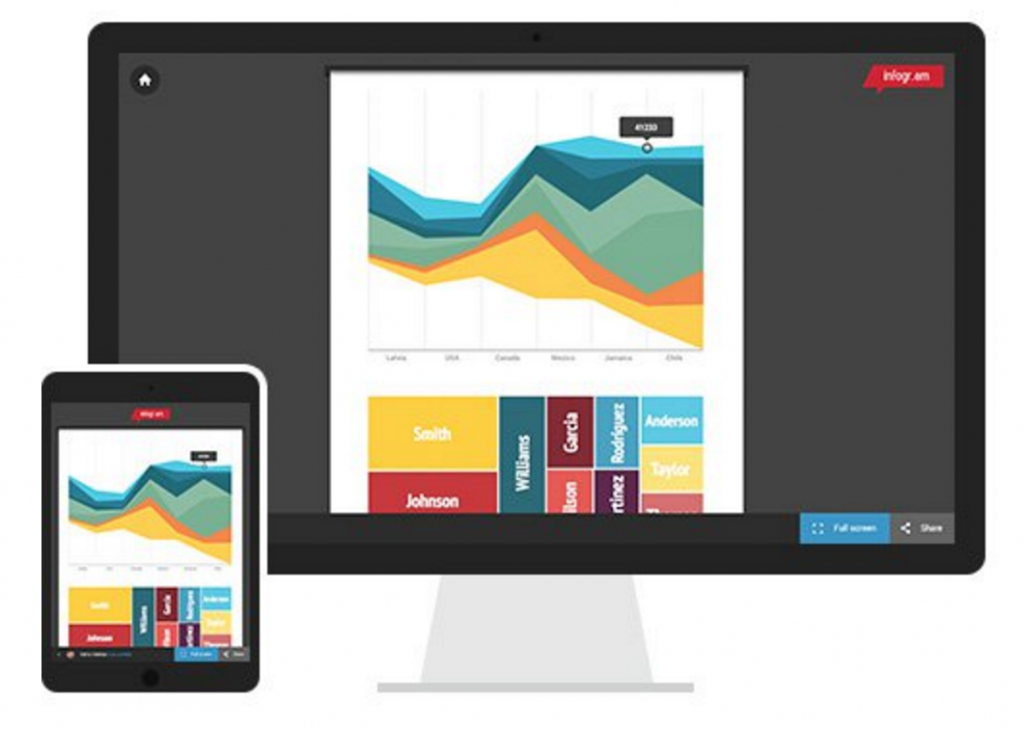
Infogr.am has a really beautiful collection of templates for data-visualisation, possibly some of the best looking here, and it’s very easy to use.
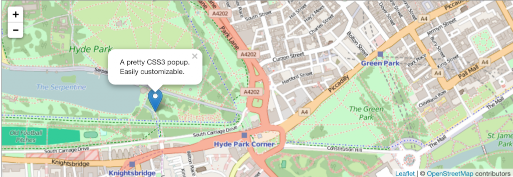
With Leaflet, you can create incredible looking maps, that are fully interactive and mobile friendly, with tonnes of customisable features.
D3 basically stands for data driven documents, but there is little basic about this tool. In fact, you should probably only use this one if you have some expertise already. However the results can be more than worth the work.
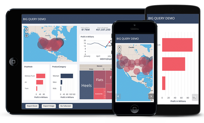
The analytics workspace, Bime has a great eye for stylish design, and its multi-device capabilities are impressive. Although it does come at a premium.
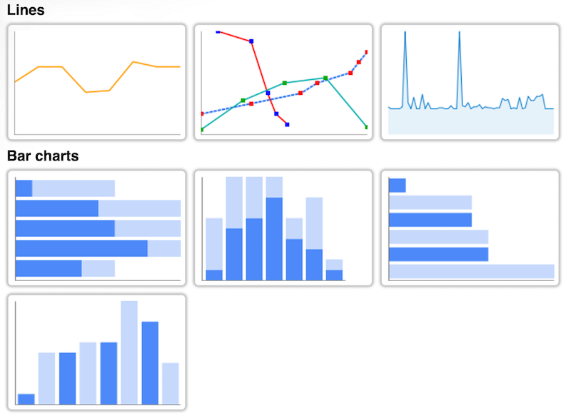
The “world’s easiest” bar chart building app, plus also one of the nicest looking and quickest to use too.

Dygraphs lets you make interactive charts which you can mouse over to highlight individual values, then click and drag to zoom-in, zoom-out or pan around.

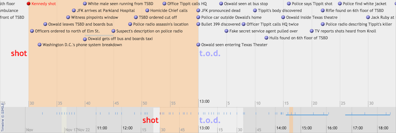
With Timeline you can create embeddable sequential timelines by uploading your data from a Google Spreadsheet. Each timeline is customisable and interactive, plus even though it’s open source it’s relatively easy to use for beginners.
Leave a Reply
You must be logged in to post a comment.