


Google is testing a new header design in AI Mode. Previously, all the tabs (All, Shopping, Videos, and so on) appeared in one line across the header. Now, only the AI Mode and All tabs are visible. When users click the All tab, the remaining tabs appear within it.
Here is a screenshot of the new design.

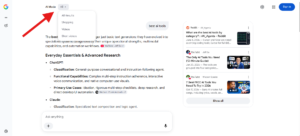
Here is a screenshot of the old design.

I think the new design looks good, though I like the old one too. My guess is that Google doesn’t want users to leave AI Mode. With the tabs hidden behind a dropdown, users have to click an extra time before they can switch to another tab, so they are more likely to stay in AI Mode.
Start the conversation by posting the first comment