


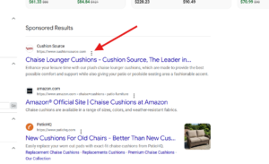
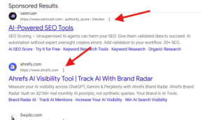
Google is testing a larger three-dot menu icon on ads in the SERP. I spotted this while scrolling through the results. It could be a test or it could be a bug, but it’s worth sharing either way.
Here is a screenshot of the larger three-dot icon.
Here is a screenshot of how it normally looks.
I’m not sure how a larger icon would help users, but it does not look fine to me.
Start the conversation by posting the first comment