 Retailers, get ready! A big holiday season is upon us and an online shopping experience that’s short of smooth is simply unacceptable.
My previous column, “10 Conversion Boosters for Ecommerce Pages“, focused on creating an exceptional shopping experience on product pages, but ultimately, the goal is to get those shoppers to checkout. Because this is the most crucial aspect of any transactional website, paying attention to the details can help you build a reputable and sustainable business – and earn you a lot of money.
So to get you on the right track, here’s an 18-tip checklist to boost online checkouts.
1. Progress Bar
Always make sure your checkout process includes a clearly numbered and labeled progress bar. Whether it takes 3 or 30 steps to complete, make sure they are all laid out clearly for your shoppers.
As a side note, an interesting thing to test here is a vertical vs. horizontal layout. Remember that there is no right or wrong. There is only what works for your customers.
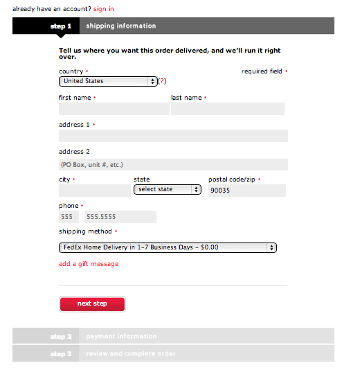
Here’s an example of a vertical bar:
And a horizontal progress bar:

You’ll notice that the best practices are common in both of them – the steps are numbered and labeled, the current step is highlighted and future steps are indicated but grayed out.
2. Repetition
Don’t ask customers for repetitive information. Once you have asked for the name, address or email, make sure that it appears across the session to that customers. If a shopper needs to type the details again, they may find it cumbersome and simply abandon the process.
3. Information Copying
If the same information is required twice in the checkout process, make sure that a client can copy it instead of entering it again. Better yet, make it as simple as a click of a button. For example, if a shopper has the same billing and shipping addresses, give them the option to use the same information again easily.

4. Distractions
In the checkout process, it’s important to remove any distractions so the customer can focus exclusively on the transaction process. Don’t give them a reason to click away and bounce from that page.
Up and cross selling are great, but they need to be tightly related to the purchase in progress. By all means, suggest extras and accessories, but your main nav and any dynamic graphics should be completely avoided in this area.
5. Error Messages
In the event that you are using error messaging, make them friendly and easy to understand. Please, no in-your-face “INCORRECT USER INPUT IN PHONE FIELD!” messages. Instead, try something a little softer like “Please re-enter your telephone number.”
If you want to take it a step further, create error messages that relate to your product or brand. Here’s a great yoga error message from Lulu Lemon:

6. Error Areas
In case the checkout error messages occurs on a page other than the page with the errors, preserve the information that the user has already input instead of asking them to enter it again. If they have to re-enter all the information again, they’re very likely to bounce off the page.
7. Pricing
Make sure that you clearly display your prices and shipping charges and taxes before the checkout process is completed. If you’re unable to do so, use a tax estimator like this one:
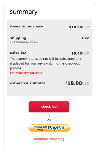
Whereas it might not be 100 percent accurate, it’s usually close enough. No one wants to buy something before knowing exactly how much it costs.
8. Confusion
Don’t display complex formulas for shipping prices that will confuse the customer. Just calculate the price and show it to them in a definitive manner.
9. Free Shipping
Consider making shipping free, if your business can afford it. You conversion will improve remarkably if you are able to offer this advantage.


10. Delivery Time
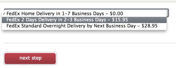
Always estimate the delivery time and make sure it’s clearly conveyed. It’s always useful if you add a margin to the delivery time. It’s better to deliver before the time than to deliver afterward, right?
11. Delivery Method
Make sure to mention the delivery methods available and provide a reference number and tracking information for the shopper to follow up with. Nothing is more frustrating than spending your hard earned dollars on something and having no idea where it is.
12. Simple
Always keep the checkout process simple with as few clicks as possible. The more pages you add between the product page and checkout, the more risky your sales process becomes.
Take the time to lay out your entire process. One technique I use is that I print out every single page of the process, stick them all on a wall (seeing it offline really puts it in perspective), count how many clicks it takes to checkout, and find ways to either combine or eliminate steps.
13. Stock
Display the stock status of your items and do so before the user puts the item in their cart. This way the shopper does not make it all the way to the end of the process, only to find out that the order can not be fulfilled. If you don’t have it, don’t sell it.

14. Reaffirm
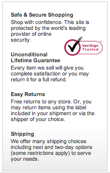
Always restate the offer and guarantee/warranty on the order forms. Shopping cart abandonment is always an issue. Do your best to curb this by displaying the offer again on the order form.
I love the 100 percent Unconditional Lifetime Guarantee and Easy Returns policy from Eddie Bauer.

15. Payment Methods
The Internet is a global marketplace, so it is important to make sure that you have as many payment methods available as possible. Make sure that you display all of these methods clearly in the checkout process.
16. Payment Flexibility
Offer different payment options such as three payments or even a “try before you buy” offer (have them pay shipping upfront and the rest over 30 days). Creativity is the name of the game here.
Check out this payment plan from Les Mills: product + free shipping + 3 month payment plan.
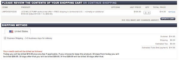
And for absolute clarity, a reiterated explanation of how your credit card will be charged:
“Today you will be billed $14.95 plus any tax if applicable. If you choose to keep the product, 30 days from today you will be billed $59.95. 30 days after that you will be billed $59.95. A final $59.95 will be billed 30 days after that.”
17. SURI
No, no. Not Tom Cruise’s kid. SURI stands for simple, usable, reassuring, and intuitive.
Go through your entire checkout process and ask yourself (and others) at every single step:
- Is this simple?
- Is this usable?
- Is this reassuring?
- Is this intuitive?
Only when you’ve answered “yes” to every single one of those will your checkout process be ready.
18. Test & Refine
Even if all these tips are proven best practices, you’ll never really know their effect unless you test. Some of them might work for you, others might not. So implement things in a controlled environment, keep a close eye on your important metrics and never stop testing and refining your process.
So are any of these tips currently in your checkout process? Are there any you’re curious to try? What kind of tests have you run and which ones have yielded positive results? Share your thoughts and questions in the comments below.
 Retailers, get ready! A big holiday season is upon us and an online shopping experience that’s short of smooth is simply unacceptable.


Leave a Reply
You must be logged in to post a comment.