Google Analytics has always been very good at telling you what people have been viewing and clicking on your website, but in the past, you always had to guess what type of people were coming to your site. You would have no idea whether you were reaching the target market you thought you were or if specific products or platforms brought in people older or younger than you imagined.
The launch of the Demographics reports in 2013 means we can now have some very powerful data at our fingertips to help us understand our website audience much better.
To get this data, you need to implement a slight tweak to your Google Analytics code if you haven’t already. When it launched, Carrie Hill wrote a great guide to help you get set up.
When turning the functionality on in your Google Analytics account, you will also find links to Google’s guides for classic and Universal tracking code updates. So I’m going to launch straight into how you can use the reports to help you get more from your website.
Overview
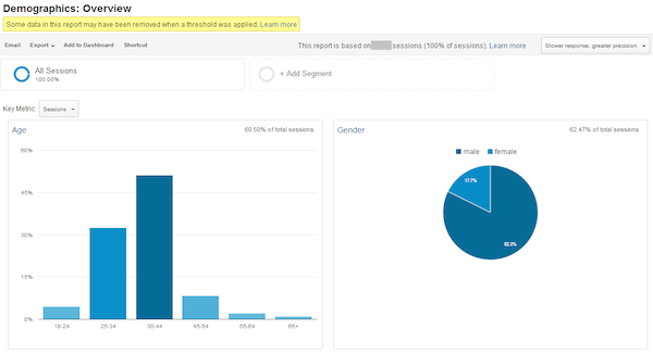
The overview gives you a great snapshot of the people coming to your website, with Age in a column chart on the left and a pie chart showing gender on the right.
The yellow warning that says: “Some data in this report may have been removed when a threshold was applied” is a sign that you have reached a level of granularity in which individuals may be easier to identify, therefore Google Analytics has removed some of the data to ensure it is high-level and cannot be used to identify an individual.
The percentage of data used is shown in each box in the top corner to help you understand the size of your dataset. This can happen for Age, Gender, and Interest Reports and any report or segment that uses these.
Additionally, keep an eye out for the sampling warning in the top right. The example above shows 100 percent but sometimes you will reach sampling limits so the data will be slightly less accurate.
From the Overview page, you can change the little drop-down from Sessions to four additional on page metrics:
- % New Sessions to help you see if you’re attracting the new audience you think you are.
- Avg. Session Duration to find out if some types of people spend longer on your website.
- Bounce Rate to see whether some visitors are more engaged than others.
- Pages / Session, again helps you see whether some ages or genders engage more with your site that others.
Age
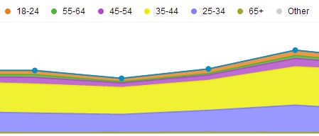
The age report graph is one of the most visually exciting things in Google Analytics. Each age group is a different color and shown as a stack graph where each group is a block of color on top of the next. This helps you see patterns and changes in Age group activity over time and easily spot your biggest markets as well as new opportunities.
The data shown in the table is very informative about which age groups are most valuable to your website. With the standard ABC Summary report showing the key metrics and the ability to drill down into Site Usage or Conversion data through the links above the graph, you can find out how people of different ages digest your content and convert in such different patterns.
Use an Advanced Segment here to split out your marketing channels and see which channels bring in which types of people to see whether the success matches up from entrance to completion in the customer’s journey. If you find that younger people are more likely to come via PPC but spend less than older people who come in organically, you may want to rethink your strategy.
Gender
What I have found very interesting with the introduction of Gender data in Google Analytics is the splits in gender across different countries and the differences in browsing activity that you could only imagine previously.
Global companies will find gender data very useful to know where their biggest emerging markets are within gender splits. It can also really help with content planning and even product buying choices.
Spotting differences in conversion rate, bounce rate, average order value, and more will allow you to make the detailed changes to your website and strategy that help you make great long-term gains.
In addition to using this report as it stands, I highly recommend that you use Advanced Segments to break down male and female data across all reports. I’ve shared the segment for each of these here:
Females: https://www.google.com/analytics/web/template?uid=Xb2BETWFTsC18n1wVrcu0w
Males: https://www.google.com/analytics/web/template?uid=lYt55eDtSJ6kR4i4dO7gJQ
Just make sure you’re logged in to Google Analytics, click the link, and choose which profile you’d like to apply the segments to. Then hop over to a report and implement them by clicking + Add Segment.
Interests
On top of age and gender, Google Analytics can also show us what our audience are interested in elsewhere on the Web. This can help you identify advertising targets, cross-selling opportunities, new marketing strategies, content ideas, and much more.
There are four reports here:
- Overview: With a top 10 summary in each of the following categories:
- Affinity Categories: This is a more top-level audience category that groups users based on mixed activities, for example “technophiles.”
- In-Market Segments: This shows us which categories of products our users are also in the market to purchase, such as “Travel/Hotels & Accommodations” where the forward slash represents the next level in the category hierarchy.
- Other Categories: This groups users by which categories they are also interested in browsing about, for example “Food & Drink/Cooking & Recipes.”
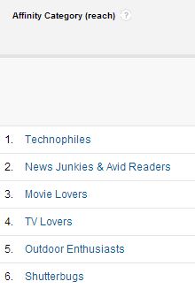
Each report shows the ABC Summary reports as normal, breaking down each category to show you whether they are engaging with your site and how they are converting. Which leads me on to some more uses for this data.
Using Demographic and Interest Data
As mentioned above, building Advanced Segments for this data will help you see it in place in other reports but there’s also a lot more you can do with this data including:
- Creating remarketing lists.
- Choosing display advertising targets.
- Segmenting for more detail.
- Identifying new markets to target.
- Profiling valuable customers.
With this Google Analytics data, it’s only your imagination stopping you from making great data-driven improvements to your website. It’s time to move away from guesswork and let Google Analytics tell you who is coming to your website and how you can help them get the most from it.


Leave a Reply
You must be logged in to post a comment.