
Getting the mobile experience wrong can be deadly to your bottom line. You don’t want to turn off customers with a bad mobile site and lose them to a competitor. Use these tips, tools, and code tricks to enhance the mobile user experience and drive more conversions.
What is a Conversion?
Angie Schottmuller (@aschottmuller), director of interactive strategic planning and optimization, Three Deep Marketing, began her SES New York 2013 session by discussing how people take specific actions on your site, whether it’s an RSVP, watching a video, submitting a form, etc.
Being a huge “Star Wars” fan, Schottmuller, highlighted that Obi Wan’s Jedi Record (i.e., conversion rate) was 50 percent; if you were to apply that same conversion rate to the actions you want people to take on your site, 50 percent would be great, right? Maybe it ends up being better, or maybe not. To understand how that affects the bottom line, you need to “rethink conversion.”
The Consequence of Getting Your Mobile Experience Wrong
Schottmuller shared two staggering stats:
- 43 percent of consumers are unlikely to return to a slow-loading mobile site.
- 40 percent of consumers are going to turn to a competitor’s site after a bad mobile experience.
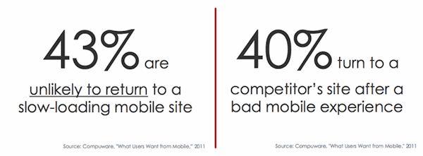
So when you’re doing conversion tests, and you’re saying, “how can we get a 5 or 10 percent lift on specific pages?” And imagine that 20 percent of your traffic is coming from mobile; if they don’t get a mobile-optimized experience, there’s a huge opportunity right there.
How to Approach Mobile Conversion Optimization
You need a plan.
A simplified layout for mobile is really the biggest thing, according to Schottmuller. Design your landing pages for mobile first and make sure they’re simplified and focus on only one product or service on the page.
Mobile is dead. Schottmuller believes there’s no such thing as mobile.
You can walk around with a laptop or MacBook Air that’s not plugged into anything, and it has Internet access, allows you to accomplish your tasks, explore, etc.
The biggest difference is touchscreen vs. non-touchscreen, which is one of the key things to consider when thinking about mobile conversions.
 Screen size is important as well. Keep in mind that there shouldn’t just three or four general sizes you’re creating pages for – soon the market will be flooded with different types of screen sizes, whether it’s in your rearview mirror in your car, or in your refrigerator in your house. You should plan how you fit those different width ranges, so that you’re not perpetually always playing catch-up.
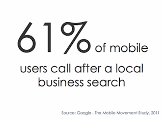
Can the user make phone calls from the mobile page? Phone calls are one of the top actions for mobile users. So make sure you present the phone number as a call-to-action – you can do this by using jQuery on the page (more below), and use CSS to style it appropriately if you want it to look like a button, move it around on the page, etc.
“Content is Only King…in the Kingdom of Context”
Given all of these different areas to focus on for mobile, you need to adapt your strategy.
What is the context for your user? Not just the device but their surroundings (i.e., where they might be when you’re asking them to take one of your conversion actions.
If you come across a website that is executed nicely on mobile, then take a look at how they did it by examining the code on their page, Schottmuller recommended.
Mobile Mini Toolbox
Here are three great bookmarklets to view a site’s source code from your smartphone:
With these tools, you can see how they’re executing on mobile (e.g., if they’re running jQuery, Google Analytics, WordPress, etc.).
Here’s a tip for taking a deeper look at the site’s code on a larger screen: use one of the bookmarklets and click anywhere in the code, Select All and Copy the code; then email it to yourself so you can open it on a desktop or laptop. From there, dump the code into an HTML editor so you can start to dissect it.
What are some other things you can do to understand your mobile users?
Detect “mobile” devices. There are a lot of different factors to consider when it comes to mobile. Detect Mobile Browsers really covers the different platforms, languages, browsers, etc. that you’re going after.
Mobile Analytics
Schottmuller noted that when it comes to Google Analytics, Webtrends or SiteCatalyst, at least 25 to 40 percent of mobile traffic still isn’t being covered by those tool sets.
What we need to do for measuring mobile is deep diving into server logs, and the above-mentioned tools just aren’t digging fast enough. So she highly recommends exploring other mobile tracking platforms. Here are three options:
Schottmuller said she has had some really good experiences with Bango and thinks it’s solid in terms of how much data it’s able to capture. So if you’ve been contemplating building a mobile app or doing anything with mobile, for that matter, and you really don’t know how much mobile traffic you have, put this on your site for 30 days, to get an understanding of what’s the reality.
Mobile Design Tricks
Schottmuller said jQuery is your friend. If you have any Flash on your site, you should set it’s life expectancy date and kill it and never let it come back again. jQuery can do the following: slide shows, any type of animation, reset the size of different components for different mobile screens, etc.
Here are some useful jQuery responsive plugins included in her presentation:
Mobile Call-to-Action Tips
Avoid using too many calls-to-action on a mobile page – keep it simple. Also, if you have a rainbow of colors on your site, you need to evaluate how you can neutralize those pages.
Schottmuller likes to use a “conversion color wheel clock” where you take your primary color on a site (e.g., a blue background) and look at the opposite color on the color wheel (e.g., red or orange). Using a tool like this helps you find contrasting colors so that you can place a button on your site that really ends popping out on the page.
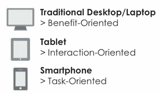
 Smartphone users are very task-oriented, whereas tablet users are very interactive-oriented, so they’ll be interested in sites that actually have the gestures and movements, etc.
Desktop users are more benefits-oriented and typically have a little more time, have larger screens, they’re interested in looker deeper.
If you have mobile pages with a call-to-action that’s far down on the page, and you want to engage the user, one tactic you can use is setting the expectation for the user at the top of the page. So you can say something like, “Fill out the form to win a new iPad3”.
They might not be able to see the how long the form is and how far down they have to go, but they’ll get a sense of what they’re asked to do from the beginning, which can help increase the amount of people that engage and ultimately convert.
Key Takeaways
- You have more mobile traffic than you think.
- Rethink conversion.
- Context is the kingdom.
- Free/inexpensive tools are available to help.


 Screen size is important as well. Keep in mind that there shouldn’t just three or four general sizes you’re creating pages for – soon the market will be flooded with different types of screen sizes, whether it’s in your rearview mirror in your car, or in your refrigerator in your house. You should plan how you fit those different width ranges, so that you’re not perpetually always playing catch-up.
 Smartphone users are very task-oriented, whereas tablet users are very interactive-oriented, so they’ll be interested in sites that actually have the gestures and movements, etc.
Leave a Reply
You must be logged in to post a comment.