On the surface, your average ad position is one of the most straightforward metrics you’ll find in Google AdWords. But trusting it too much can give you some pretty misleading information.
How is it Calculated?
The metric displayed in AdWords is an average of your ad positions weighted by impressions. What this means is that it is effectively showing you your mean position on the page based on where you mostly appeared.
Sounds obvious right? But is this really what your brain expects when you see that figure?
When averages are displayed, they are usually mean averages (e.g., the sum of the measurements divided by the number of measurements taken). But the natural interpretation of “average position” is “the position I was mostly in.”
Mean can be Misleading
Most people’s brains are wired to think of a median more naturally when they look at an average. A median average means “what position was I most commonly in?” The difference can be stark.
Picture the following scenario: Acme Inc. has the keyword [widget] in their campaign in exact match. When looking at the average position from the previous day they see an average of position 3.
It’s tempting to interpret this data as meaning that they were generally in or around position 3 for most of the day. But if instead they gained 50 percent of their impressions in the morning in position 4, then after lunch two competitors ran out of budget and their position rose to 2. They didn’t spend any of the day in position 3 but the stats will clearly show that as the average.
Now picture a more extreme scenario where 50 percent of impressions were in position 5 and 50 percent in position 1. Suddenly position 3 is a very misleading statistic about how your campaign performed.
You may make bid adjustments to deliberately drop out of the banner, but you’d find that your proportion of time in the banner hasn’t changed at all. Instead you’re now fluctuating between positions 6 and 2.
Any Other Problems?
Granted these are extreme examples. Not that many advertisers will see half their impressions in one position and half in another. Much more common (and subtly difficult to notice) is when most of your impressions come in one position, but that’s not representative of where you spent your time measured in hours.
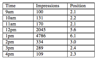
This is a complex concept to explain, so bear with me. The table below shows an advertiser’s impressions through the course of a typical business day.

You’ll notice that the ads slipped down the page dramatically at lunchtime, the busy period. The total number of impressions was 7,964 and the average position was 5.5. But actually the ads were in positions 2-3 for most of the day. What the advertiser needs in this situation is either ad scheduling or bid management that can cope with dramatic intra-day changes.
But now we come to the worst issue. Your impressions are directly correlated with your ad position. If you move into a higher position your impression share will increase and you will get more daily impressions. This will weight those times of day or days of the week much more strongly. So your average position will be dominated by the periods in which you were higher on the page, deliberately or not.
If you find that you’re in high positions at the end of the day but the rest of the day is really low, you’ll wind up with high average positions even though you generally weren’t high enough on the page to show.
What’s Our Recourse?
Now that we’ve established that average positions are lying to us, we need to remove the averaging as much as possible. Break our numbers down into the smallest possible chunks so that we see as close as possible to the true figures.
The Dimensions tab is your friend.

Select an ad group of interest and navigate to the Dimensions tab. If you don’t see it, click the drop-down arrow at the end of your tabs list and tick the box to enable that tab.
From the drop down box in the tab select the “Hour of Day” dimension. Set your date range to a single day, and voilà. The smallest unit of measurement that you can see from AdWords.
This is where you’ll really get an idea where your ads are appearing and how many impressions you’re getting in each of those positions. What you’re really looking for is signs that you are spending some parts of the day in low positions (with low associated impressions) and some parts of the day in high positions (with high associated impressions). These are your opportunities to start making decisions to restrict the high areas or push more aggressively in the low areas.

Impression Share
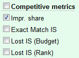
The impression share is a great addition to this kind of analysis. It will give us an idea of exactly how much traffic we were sacrificing being in a particular position. Navigate into the “columns” button to enable the impression share view.

Remember that your impression share is affected by more than just your position on the page, but also your available budget and other factors. But assuming other things being equal (and your campaign isn’t limited by budget and running on standard delivery) you should be able to get an idea how much the low position at a certain time of day is costing your campaign.
Google Analytics
Google Analytics would seem at first glance to be the ideal tool to dive deeper and get the true data. It lets us break down statistics by the ad slot we appeared in on the page. However despite claiming that viewing impressions by ad slot is a valid combination, all your data will come back as zero.
As of the time of writing, Google Analytics simply won’t give you any data about clicks or impressions on your ads broken down by position on the page, despite being willing to give us visits or on-site metrics broken down that way.
How Will We Use This?
It’s great that now we understand that average position is lying to us, and we have an option for getting better quality data. But it’s not necessarily as simple to act upon as we thought.
We have a good idea what position we’re appearing in for each part of the day. It’s now up to you to think about the following:
- What is my conversion rate like at that time of day? Should I be pushing further up to page to get more good quality traffic?
- Do I think my target audience is likely to be searching at particular times? Am I adequately targeting people at the times they’re going to be looking for me?
- Why am I in each position at each time? Are there particularly competitors whose actions are influencing me?
If you can answer these questions you’ll be in a good position to start making adjustments to your bids or ad scheduling based on better knowledge of your search landscape. You should see returns from your top keywords improve, and hopefully start getting somewhere with keywords that you think should be doing better than they are.
Have you used this sort of technique? Do you have another approach? Let us know in the comments below.


Leave a Reply
You must be logged in to post a comment.