For the past five to six months the search industry has been buzzing with talk around the biggest change to Google search results for quite some time – the mobile-first index.
In the midst of this noise, it is very easy to get lost with what you actually need to know about the update.
This post will give you a quick overview of what the update entails, as well as the main things to check for on your site to prevent a loss in traffic.
What is the Mobile-First Index?
The mobile-first index is a change in the way Google is going to index content.
Currently, Google looks at the desktop version of a site and then bases how it will rank the mobile site according to that information. Once this update rolls out, the opposite of that will happen. Google will begin looking at your mobile site and from that, will rank the desktop site.
When will it be released?
While we are still waiting for an official release date, we do know the update is in the pipeline and being tested.
Whenever Google gives us further news on when the update will be released, they repeat the message that it is still ‘months’ away. From their comments, we can assume the release is going to be in the second half of 2017.
Why is this happening?
Nearly two years ago Google announced more searches occur on mobile than desktop.
As mobile is now the predominant way for people to search on Google, it makes sense for them to ensure the experience on this device is as good as it can be.
In lots of situations, sites provide a worse or thinned down user experience on the mobile device, that is not as good as the desktop site. This happens more on mobile sites where separate URLs are used or where dynamic serving is being used.
What to check on your site
Content
Look at the mobile version of your site. Is the content from the desktop version visible/accessible? You should be providing a consistent experience for users no matter the device they access the site on.
One of the things to consider is the actual content on the site. If you are currently removing or hiding content on your mobile site, think of ways in which you can have this content on both. You ideally want content to be accessible regardless of how the site is accessed.
Make sure you also consider the best way to move this content over to the mobile site. You do not want to sacrifice your user experience just to meet this requirement.
For example, do not put a content block with 300 words of content at the top of an ecommerce category page, pushing all your products way down the page. Consider moving the content lower down the page or partially hiding it with a ‘read more’ button or in an accordion. (I’m not a big advocate of read more buttons, but do whatever works best for your site!)

Along with the actual content on the page, ensure your headings (H1s) and titles are not missing and are set as you want them to be.
The speed of your site is an essential thing to consider to help improve usability, especially on mobile. Google already considers page speed when ranking a page, and this will be just as important when the mobile-first index is fully live.
Personally, I feel it would make more sense if this ranking factor was taken into consideration more when the mobile-first index is live. Accessing a site can be a painful experience on a mobile device when not connected to Wi-Fi, and it would make sense for Google to prioritize this usability factor more.
To check whether you need to action anything with this issue, test your site in Google’s PageSpeed Insights Tool. Alternatively, use my site speed tool of choice, GTmetrix. If any problems are shown, fix them!
If your site is not loading in around three seconds, I recommend looking into the reasons behind this and seeing why your site is slow. GTmetrix has a great Waterfall feature that is incredibly useful when trying to see which requests are slowing down your site.
Internal linking/site structure
A well-known issue with sites that use either dynamic serving or separate URLs for their mobile site is that the internal linking is vastly different to the desktop site. This can cause some user experience issues for readers as they struggle to find content that can be easily discovered on the desktop version of the site.
Similar difficulties are caused when Google crawls the mobile site. If your internal linking/information architecture on the mobile site does not closely replicate the desktop, this can cause internal link equity to be poorly distributed throughout the site, which will cause a drop in rankings.
Structured data
In a lot of cases, structured data is removed from the mobile version of the site. Unfortunately, you are going to have to move all your structured data over to the mobile site, as Google will begin looking towards that for structured data.
Use Google’s structured data testing tool on your mobile and desktop site to see if the structured data is the same across both devices.
Which sites are currently at risk?
Firebox
While the Firebox site is responsive, currently it hides content on category pages with no way to access it once you visit the mobile device. This goes against what Google is recommending. Here is an example:


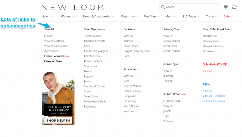
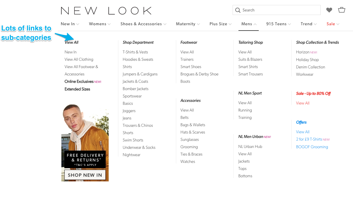
New Look
The New Look website suffers from similar issues to Firebox, except this time they are also removing internal linking along with content. See examples below:

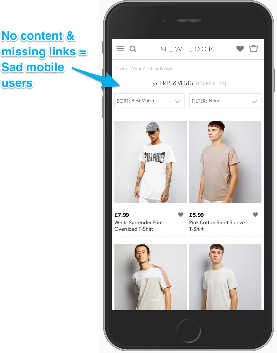
They not only remove content from the actual main body of the page, the internal linking from the main navigation has also been reduced on mobile so it only links to the parent categories.
This is causing a large number of pages to be an increased number of clicks from the home page, which is less than ideal. See below:

There are plenty of further examples across multiple sites. Unfortunately, as Google noted in their original blog post on the mobile index, sites tend to provide vastly different content on the mobile version of their site.
While I believe that adjusting elements and the prominence of them for mobile users is something that makes sense, such as promoting search further and hiding elements in dropdowns/accordions, you need to ensure the experience is at least consistent. Avoid removing core parts of the page such as internal links and content.
A prediction for the future
Given what Google has already announced regarding the mobile index update, it is evident the main issue they are trying to tackle is poor usability of the mobile site.
Over the past year, there have been multiple updates that target sites that are ad-heavy, with low-quality content. These updates include the core/Phantom updates as well as the recently released mobile interstitial update in January.
Considering the smaller screen space on mobile, I imagine Google is only going to get more aggressive in penalizing ad heavy sites with intrusive interstitials.
I expect that future core updates will be harsher on sites that ruin the mobile experience of the site with ads. If this is something that you do, update your sites so ads are less intrusive. It’s bad for your brand, users and traffic. There is a way to implement ads without ruining your site.
To summarize
The mobile index is going to be a significant change in the way Google ranks sites. To ensure you are not negatively impacted, make sure that your user experience is similar across both the mobile and desktop site.
If you do not have a responsive site, make sure you check to see if you have any of the above issues. It may also be a good time to consider creating a responsive site to benefit from reduced maintenance.
Any questions, feel free to comment below or tweet me at @SamUnderwoodUK.


Leave a Reply
You must be logged in to post a comment.