Author
[email protected] [email protected]
Date published
January 24, 2014
Categories
Google announced that they are changing the user-agent they use when crawling content for smartphones. It will now be:
Mozilla/5.0 (iPhone; CPU iPhone OS 6_0 like Mac OS X) AppleWebKit/536.26 (KHTML, like Gecko) Version/6.0 Mobile/10A5376e Safari/8536.25 (compatible; Googlebot/2.1; +http://www.google.com/bot.html)
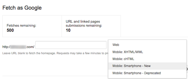
Update your tools. Meanwhile it’s possible to Fetch as Googlebot in Google Webmaster Tools using the new user-agent string.

In the announcement they mentioned that some site owners were accidentally blocking their content from smartphones with a disallow directive in the robots.txt for googlebot-mobile.
“The new Googlebot for smartphones crawler will follow robots.txt, robots meta tag, and HTTP header directives for Googlebot instead of Googlebot-Mobile,” Google noted.
This is supposed to have a very minimal impact across the web, but seems like Google would want to have as many candidates as possible for search results that work well with smartphones.
Fast and Steady Wins the Race!
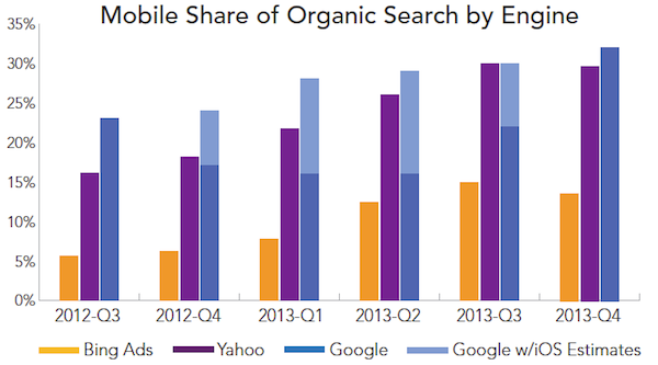
This is one of many smartphone related “improvements” Google has made stressing the importance of mobile search. This especially evident when considering search growth is happening predominantly with mobile devices. People are increasingly in the habit of searching, but moreso on their smartphones.

With Google holding the lion’s mobile share it is in their best interest to arm site owner’s with knowledge to help their crawlers access and assess content that will perform well in search results presented on smartphones.

Mobile Best Practices
In response to the huge mobile search growth, a normally fast reacting Google took a very long time with their stance on what they consider to be a Blue Sky mobile configuration for a website. A
fter eventually going with responsive mobile web design as a recommendation on how to best serve the interest of users and their search results, Google has developed extensive best practices for most ways a site could serve mobile content to a user.
In addition to responsive design, they provide instruction for how best to configure mobile content when dynamically serving different HTML on the same URL and using separate mobile URLs.
More Smartphone Specific Google Webmaster Tool Insight
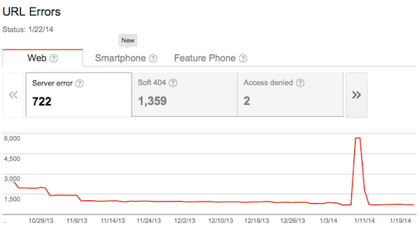
Google has also been ramping up smartphone specific insights in their webmaster tools, coming out with mobile specific URL errors in December.

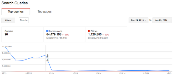
Finally! Now that Google has stopped rounding numbers, it’s possible to get fairly accurate SERP metrics for both mobile search queries and top pages.

Mobile Search is Getting Bigger
Ensuring mobile searchers find relevant and usable pages is an absolute must do. If you’re not already, time to start creating special mobile reports in 2014.
