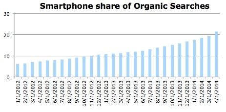
IPhones and Androids, now in their eighth and seventh year of existence respectively, have 23 percent of the organic search market, according to April data from BrightEdge’s Data Cube.

EMarketer expects 48.9 percent of mobile phone users worldwide, or 2.23 billion people, “will go online via mobile at least monthly in 2014, and over half of the mobile audience will use the mobile internet next year.”
Yet top brands aren’t yet embracing mobile optimization. Data from The Search Agency shows even the Fortune 100 aren’t measuring up when it comes to mobile.
With Google’s recent declaration that slow sites can be negatively impacted in mobile rankings, and the update of its mobile recommendations in PageSpeed Insights tool, you can begin to see how quickly the standards are progressing.
If you aren’t doing mobile – and doing it well – your site is destined to be left behind in the search results. But it’s common to not know where to start or how to best execute a mobile-optimized site.
So before you can run, you have to walk, and that first step begins with deciding which type of configuration you’ll use for your mobile site: responsive, dynamic, or redirection to mobile URLs.
Responsive, Dynamic, Mobile URL – Which is Best?
Google supports smartphone-optimized sites in three configurations, and explains those options here:
- Sites that use responsive web design, i.e. sites that serve all devices on the same set of URLs, with each URL serving the same HTML to all devices and using just CSS to change how the page is rendered on the device. This is Google’s recommended configuration.
- Sites that dynamically serve all devices on the same set of URLs, but each URL serves different HTML (and CSS) depending on whether the user agent is a desktop or a mobile device.
- Sites that have separate mobile and desktop URLs.
If you’re on the fence about which way to implement a mobile-optimized experience, there are a few things that can help you decide.
The goal is to first determine if you will be showing the same or different content by device. Does the intent of the visitor differ by device? If someone is visiting your site from a desktop versus a mobile device, what is each type of user trying to accomplish?
If visitors are trying to do the same thing while on a desktop as well as a mobile device, you would serve the same content, so responsive would be your choice. One example of this is a news site. People are coming to your site to read content, no matter the device. The site may style the content slightly different for mobile, but it’s essentially the same content.

If visitors want to accomplish something else when they’re on a desktop versus a mobile device, then you may consider serving them different content. This can be in a dynamic configuration, or a redirect to a separate mobile URL.
Remember that dynamic would be the same URL, just a different experience, whereas mobile would redirect to a mobile version of the site on a different URL. Here are a couple examples:


An example of when one might serve different content is a clothing store that sells online and also has storefronts. This brand would likely have visitors to the site that come with a different intent per device (research or buy on desktop versus finding store location and phone number on mobile).
Keep in mind that as mobile device usage continues to grow and sites are savvier with mobile implementation, research and purchases will likely increase on mobile, so the intent may start to meld across devices.
Serving unique content to visitors based on device dynamically is especially useful if your desktop content is “heavy,” and you don’t want people to have to wait for it all to load. Williams-Sonoma.com is a good example of dynamic serving (try it on your phone versus desktop).
Common Obstacles in Configuration
Dynamic is more complicated to implement technically. Google is very clear on using the Vary HTTP header to indicate that the content varies by user-agent, for example, smartphone.
Common pitfalls when detecting user-agents are discussed at length here. Pay special attention to avoiding cloaking when implementing this configuration.
Redirects to mobile-specific URLs also experience a host of problems when not configured accurately. Google addresses some of the common mistakes it sees here, which include:
- Page speed issues like slow-loading pages, which create a bad experience for users and cause them to abandon the request. Google suggests mobile pages render in less than one second!
- Faulty redirects, like sending all mobile users to the mobile home page of a site, instead of a mobile version of the content they were trying to access.
- Disruptive experiences that send mobile users to a splash page, of sorts, to force the use of the mobile app versus giving them the content they are trying to access and letting them choose. There are tasteful ways to go about this, and Google recommends using a simple banner to promote the app inline with the page’s content.
Google recently announced it would warn mobile users when a site has faulty redirects if users were trying to access the site from the search results. Google will now serve up a “try anyway” message, like the one pictured here:

And, Google Webmaster Tools will help webmasters find those redirects more easily.
Advanced technical SEO issues also exist during implementation, but that’s for another post. The point being that misconfigurations can have a big impact on goals, rank, traffic, leads, and revenue.
In fact, BrightEdge research conducted in April showed on average, incorrectly configured smartphone websites are losing 16 percent of their would-be total traffic.
With all of the potential issues with dynamic and redirect to mobile URLs, it’s no wonder Google recommends responsive design. But it’s not without its flaws, either. If going the responsive design route, keep this in mind:
- Implement conditional loading for faster page load times, reduce the number of asset files to download, and reduce the file size of large images or video asset files.
Be Mobile, but Be Strategic
First and foremost, mobile is about creating a great experience for your audience, anticipating needs, and delivering on that with stellar content. Beyond that, implementation issues can hinder performance, so it’s key to know what some of those pitfalls are before pursuing a mobile-optimized experience for your visitors.
What you don’t want is analysis paralysis, where you’re not pursuing mobile at all. Look at your analytics and you’ll surely see your mobile audience is growing, and can’t be ignored.
Now is the time for mobile.


