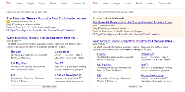
The new Google search layout users began seeing a couple weeks ago on a limited basis has now gone live to all users.
Google’s new layout, which changes the font and removes underlines from links, as well as displays the AdWords ads at the top differently, has definitely been getting poor reviews as it rolled out to everybody.
The headlines are larger the description text seems to be slightly lighter and they have adjusted the fonts with the wider typeface.
For AdWords ads, gone is the light yellow in the background that we have long associated as being advertising space for many years now. The new style doesn’t have any shaded background, instead it has a tiny yellow “Ad” marker next to the green URL. There is also an underline separating the ads from the organic search results.
Beyond the cosmetic change, the new search layout is affecting SEO in a pretty pronounced way. Titles that were optimized to the maximum 70 allowable characters for SEO purposes will now find the same headlines truncated in Google’s new results, giving everyone about 59-60 characters to work with. This means you might have a lot of work ahead of you trying to rework titles so they don’t appear poorly truncated in the search results, which could impact click-throughs to your site.
The first time many user saw the changes, many users thought they actually had their search hijacked or were falling victim to Google spoofing, because the search results looked completely different. And the reviews definitely aren’t good across the board, judging from all the comments by very upset searchers, something that actually made the switch to another search engine strictly because of the new look.
To me, it looks like a throwback to how search engine results looked 10 to 15 years ago, such as on Webcrawler or Hotbot, not something that has been refreshed for 2014. And I do agree with many people who say the new font makes it much harder to read and scan when on a desktop.
Google’s logic behind the new change was that they make the changes for mobile and tablets, and they carry out over several the design changes to desktop users. Google said they feel this creates improved readability and a much cleaner look. And they had an end goal of creating a consistent user experience across multiple devices (desktop, mobile tablet):
Towards the end of last year we launched some pretty big design improvements for Search on mobile and tablet devices (mobile first! :-). Today we’ve carried over several of those changes to the desktop experience.
We’ve increased the size of result titles, removed the underlines, and evened out all the line heights. This improves readability and creates an overall cleaner look. We’ve also brought over our new ad labels from mobile, making the multi-device experience more consistent.
Improving consistency in design across platforms makes it easier for people to use Google Search across devices and it makes it easier for us to develop and ship improvements across the board.
Will we see any changes reverted back? Hard to say, but Google doesn’t too often revert back on their changes once they’ve jumped in and made them.
