 Responsive design is all the rage these days, but most folks don’t really know what it means. Consequently, when they ask a design firm to build a responsive website, they end up with what they asked for, but not what they really need.
- Responsive means that a single site design scales to fit reasonably well on a desktop, tablet, and phone. Which means that a site with lots of content becomes very hard to read on the smaller platform. Oftentimes, designers employ a Mobile-First design approach to design the site so that it looks and interacts well on the phone, and then scale the design up for the tablet and desktop.
- Task-Oriented provides a different version of a site for each of the three platforms. These different designs are optimized to address the different usage models of the three platforms and the needs of the users’ tasks within each of those usage models.
- Consumption Tasks: Some sites focus solely on providing content for consumption, such as CNN, Wall Street Journal, etc. With these sites, there is little interaction beyond finding interesting content and responsive design may be sufficient.
- Interaction Tasks: Most other sites, though, require and depend on a richer, more complex interaction model. If your site requires more doing than reading, yours is an interaction task site, which can’t be successfully served with a responsive design.
You should consider the following usage models when determining the tasks you expect your users to perform on each of the different platforms.
Usage Models
For the most part, users tend to use each of the three platforms differently. While exceptions do occur, the following are some general usage paradigms.
Laptop/Desktop
 Users at a laptop or desktop tend to be rather stationary and focus on their tasks for longer periods of time, performing more complex tasks. The more complex the task, the more likely they are to focus intently on their task and ignore other tasks; more serial-tasking than multi-tasking.
Desktops are more efficient than tablets or phones due to a combination of keyboard size, size of the display, the time it might take to perform more complex tasks, etc. When users need to focus solely on one task with rich content and controls, they are more likely to need to sit down at a desktop.
Tablet

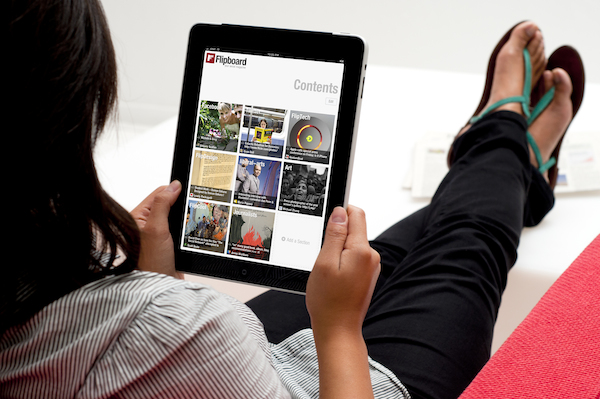
Tablet usage tends to be mostly stationary or confined to a defined area (coffee shop, warehouse, hospital, plane). Their tasks are usually of a shorter duration and less complex and can be a blend of serial and multi-tasking.
For instance, they may sit in a coffee shop for 20 minutes, reading a news site, looking up hotels, etc. They may also be somewhat mobile, but pause to perform a task, such as taking inventory in a warehouse, reviewing a medical record at the bedside, etc.
These users typically only use the virtual keyboard to capture limited data and rely more on interaction controls for selection and control.
The virtual keyboard affords more input and control than a phone, but still limits the user to what can be done easily. Users will likely not want to switch keyboard modes (character, numeric, special characters) to use any punctuation or symbols as this interrupts their cognitive flow.
Numeric entries should either be accommodated by picker controls or should automatically switch the keyboard when the user selects a numeric entry filed. A tablet is useful for reviewing content, but not for entering large amounts of content.
Phone
 Phone users are often multi-tasking, on the move, and perform shorter, simpler, more focused tasks. Their tasks are also much more immediate or location related, such as finding a coffee shop, reading and replying to a text, etc.
Time on task is often limited and users want to input minimal information and perform short task sequences to achieve task success. Even though these users may be quite adept at using the small keyboard for texting, they are not as proficient at tasks that rely on more accurate input. Texting is unique in that it doesn’t rely on the typing accuracy common to most other tasks.
Given that most people use only their thumbs to type on a phone’s virtual keyboard, it should come as no surprise that content rich tasks are not well supported on a phone. The phone is better at receiving simple alerts and to provide quick responses than a laptop.
More likely, the phone user will be attending to something or someone else when an alert comes in and they merely need to respond appropriately and continue with their current task.
Task-Oriented UX Design
Most design teams never conduct a thorough task analysis to identify the various usage models common to their user’s task environment. Identifying and optimizing the user’s tasks and usage models for each platform is often the difference between a dominant UX and one nobody remembers.
Consider the process of making hotel reservations, a seemingly simple task we are all familiar with. Users perform richer, complex reservation research tasks at a desktop, such as switching between looking up restaurants, entertainment venues, area maps, transportation options, etc. Their tasks are much more complex than merely making a hotel reservation and demand a more robust UX.
They might finish this task on a tablet at a later time, such as when sitting in a coffee shop the next morning. They have likely narrowed the choice to a select few hotels and merely need to review the rooms and rates for each to make a final decision. Making a reservation on the tablet is rather easy if the users don’t need to conduct any of the other associated research tasks.
The phone might be used more for reviewing or changing a reservation, checking in, and getting directions to the hotel rather than making a reservation.
Consider that a phone might also be used to make a simple, quick hotel reservation near your current airport in the event of a cancelled connecting flight. An emergency reservation task is more location and time dependent than a laptop or tablet hotel search task and requires a different UX approach.
In those situations, an app that recognizes the user is at an airport might list only those hotels with airport shuttles and streamline the reservation process to limit the options. These users aren’t interested in views or pools as much as they are just getting a room before the other stranded passengers grab them.
Summary
About the only sites that scale well in a responsive design are consumption sites requiring simple user interactions.
Responsive is a terrible approach for interaction sites with complex, task-oriented interactions. Such complex sites are better served with task-oriented designs that produce different types of interaction models optimized for each device’s tasks and usage model.
Many sites and apps fail miserably because they do not consider the task environment or device usage models. So, before jumping on the Responsive Design bandwagon, make sure it’s the right approach for your site.
 Responsive design is all the rage these days, but most folks don’t really know what it means. Consequently, when they ask a design firm to build a responsive website, they end up with what they asked for, but not what they really need.
 Users at a laptop or desktop tend to be rather stationary and focus on their tasks for longer periods of time, performing more complex tasks. The more complex the task, the more likely they are to focus intently on their task and ignore other tasks; more serial-tasking than multi-tasking.
 Phone users are often multi-tasking, on the move, and perform shorter, simpler, more focused tasks. Their tasks are also much more immediate or location related, such as finding a coffee shop, reading and replying to a text, etc.
Leave a Reply
You must be logged in to post a comment.