With every new feature, Google Analytics becomes more powerful, but also more complex. Hidden in the nest of menus are four powerful features that you might have overlooked.
How many times have you sat as your browser loads and loads a page? How many times have you just given up, hit the back button and found another website?
Page loading time is directly related to both user satisfaction and conversion rate. This is especially true of landing pages and home pages.
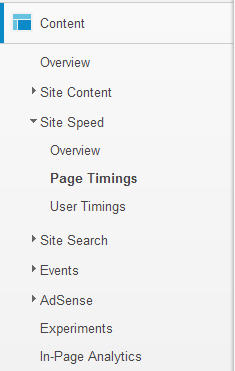
Google Analytics now allows you to see the average loading speed of individual pages on your site in the Page Timings report, which you can find on the Content menu:

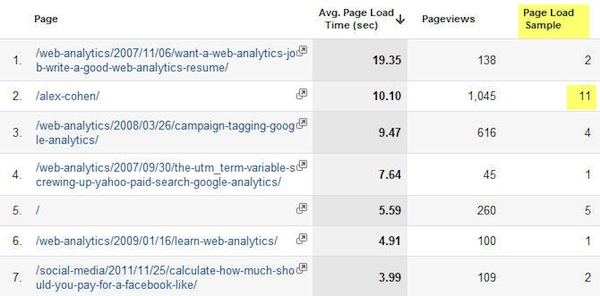
The report shows you the average page load time, in seconds, which allows you to quickly pinpoint the offending pages that are getting a decent number of page views:

Page attention to the Page Load Sample, which reports the number of times Google has crawled this page to get the Average Page Load Time. A higher number means it’s more reliable as an average. A sample of one or two could be easily skewed by one slow day.
2. In-Page Analytics
Ever since the rise of ultrabooks and mobile phones, screen size has been on a decline from the days of desktops. That carefully considered and immaculately designed call-to-action you created may be beautiful, but what’s the good if most of your visitors can never see it?
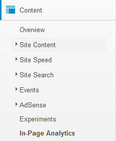
Google is sunsetting their standalone Browser Size tool in favor of the In-Page Analytics report built into GA, which you can find in the Content section:

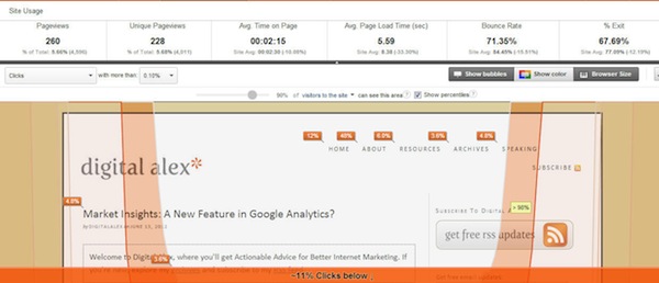
Click on the Browser Size button, next to Show color and under the metrics. You can navigate your site like you would normally do in a browser and the data will refresh.
Hover over the bands on your pages to see what percentage of visitors can see various sections of the page. These data are even more useful than Browser Size, because they’re based on actual visitors instead of Internet averages.

3. The Network Report (aka Reverse IP Lookup)
Google Analytics records a variety of technographics for every visit to your site, things like screen resolution, operating system, etc.
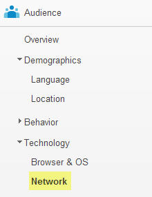
They also record the Network of the visit, which you can find in the Audience section:

Most of the networks listed will be Internet service providers (ISPs), but you will also see company names for offices large enough:

For B2B companies, this is a scrappy way to know which prospects are researching your products. It can be great for prospecting and lead nurturing.
4. Visualize With Motion Charts
Visualizing and comparing data over time is a powerful way to expose trends that might otherwise go unnoticed. But, it can be challenging to do that for multiple data points and segments at once, especially in a conventional spreadsheet format.
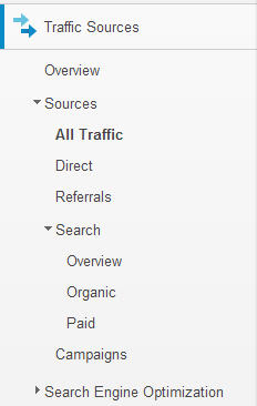
Consider the amount of traffic you receive from various channels, which you can see in the Traffic Sources report:

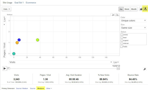
One powerful way to see which channels are driving visitors and their content consumption is the Motion Chart option, which you can activate by clicking on the bubble icon above the data:

Motion Charts uses four tools to help you visualize trends:
- Size: Varies bubble size by metric, so you get a sense of proportion.
- Color: Easily identify the various segments.
- X axis: Plot one metric, such as visits.
- Y axis: Compare to a second metric vertically, such as page views per visit.
When you activate the chart, the size and location will vary according to the metrics you’ve defined as they change over time.
A simple way to get started is to watch traffic and average page views change over time, particularly useful for a blog or content site.
- Go to Traffic
- Choose All Traffic Sources
- Select Medium (Looking for the Primary Dimension options above the data)
- Choose the Motion Chart and hit play
