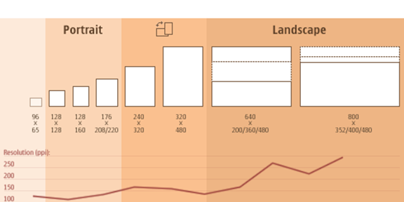
Last week, there was little surprise when Google’s Pierre Far announced responsive design as company’s formal recommendation for mobile delivery. Responsive Web Design is the approach that a design should be flexible enough to adapt to the screen size and platform of the visiting user.
This (relative) uniformity in user experience would appear to be wonderful for search engines and developers alike.
Google was going to face a major conundrum: if every site had an entirely separate experience for mobile and desktop users, which site would actually be the one worthy of the incoming link? Would that rank pass to the mobile site and, if so, how much and why?
This is especially important when considering that there are predictions that mobile usage will overtake desktop usage by 2014. By encouraging developers to create one cogent web experience that adapts to the platform, Google is likely able to preserve many of its link algorithms and — to a certain degree — avoid the daunting burden of attempting to evaluate mobile and desktop versions as separate entities.
For developers, the benefits are also clear: the burden of needing to maintain multiple versions of a website will disappear over time. Additionally, a move to RWD will likely create a “Mobile First” mentality, which will inevitably result in a more clear architecture and user experience that is appropriately weighted.
Understanding Responsive Design
For a design to be responsive, it typically needs the following three attributes:
- Fluid Grid: A fluid grid system uses percentages to define column or div widths instead of pixels. For example, a “hero” might have a width of 650px in fixed width design, whereas it would be labeled as 100% in the CSS of a fluid width design.
- Media Queries: Media queries enable custom CSS based on the min-max width of a browser. For example, a media query with a max-width of 450px would be intended for mobile only browsers.
<link href=”css/phone.css” rel=”stylesheet” type=”text/css” media=”only screen and (max-width: 450px)”>
- Responsive Images: Similar in nature to the fluid grid, responsive images don’t have fixed widths but instead have a max-width (typically labeled at 100 percent when displayed on a desktop). This enables images to be scaled down to fit the width of the screen on which the webpage is rendered.
The output of these attributes is simple to recognize. Simply take a responsive design such as Starbucks and manually resize the browser. You should notice the screen resizes and adjusts based on the width of the browser.
Getting Started with Responsive
Below are just a few great tools for experimenting with responsive design.
- Twitter Bootstrap: Twitter Bootstrap is a fantastic toolset for quickly building responsive sites and landing pages. Most developers consider this a must-have for its robust base CSS and Javascript plugins.
- Themeforest: WordPress addicts and do-it-yourselfers might want to take a look at Themeforest’s WordPress Templates. There are hundreds of responsive designs and a pretty active community reviewing them.
- Net Magazine: Check out Net Magazine’s top 50 tools for Responsive WordPress Design.
Immediate Impact
Responsive Design should help encourage the proliferation of more mobile experiences, especially in the small/medium business world. This unofficial standard will be an important step as it will ensure many small/medium businesses will have a mobile presence without significant additional expense. Whether these presences will be able to monetize will be a different story.

Leave a Reply
You must be logged in to post a comment.