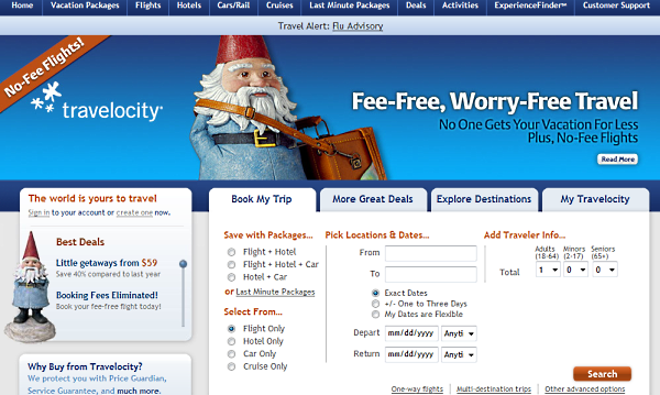
Travelocity Unveils New Design for Homepage
Travel search site Travelocity has redesigned and features a more minimalistic style. Don’t worry. The gnome is still there.
The new design centers around four main tabs:
A “Best Deals” box on the left side features the latest in travel deals.
“In researching the approach for the new homepage, travelers indicated to us that what they wanted from an online travel company is a greater emphasis on deals and relevant offers,” said Victoria Treyger, chief marketing officer, Travelocity North America. “We also knew that we had to balance that sentiment with simplicity and providing inspiration. This design addresses each of those challenges in an easy-to-use format.”
What do you think of the new design? Leave us a comment and let us know your first impressions.
Related Reading:
Travel Search Site Travelocity Launches Toolbar
24 iPhone Applications That Accelerate Mobile Search
More about:
The Merkle B2B 2023 Superpowers Index outlines what drives competitive advantage within the business culture and subcultures that are critical to success. It is the indispensable guide for B2B marketers to deliver world-class experiences and keep pace with the dynamic environment. Download Now
The ClicData survey found that various challenges exist that prevent organizations from achieving such gains. These challenges included inaccessible data formats and limited flexibility in displaying data in dashboards. Download Now
The need for fraud prevention in the digital world is critical now more than ever. Why? Thinking about your own behavior, consider how you complete transactions and how this has changed over the last 5 years. Download Now
The need for fraud prevention in the digital world is critical now more than ever. Why? Thinking about your own behavior, consider how you complete transactions and how this has changed over the last 5 years. Download Now
Leave a Reply
You must be logged in to post a comment.