AOL Previews New Brand Identity for Independence Day
AOL will be going independent in December and they’ve unveiled their new branding. A new minimalist font has been selected, the “o” and the “l” have been lowercased, a hip period has been added. I love closure. Oh – and the company name will be set against an ever-changing image.
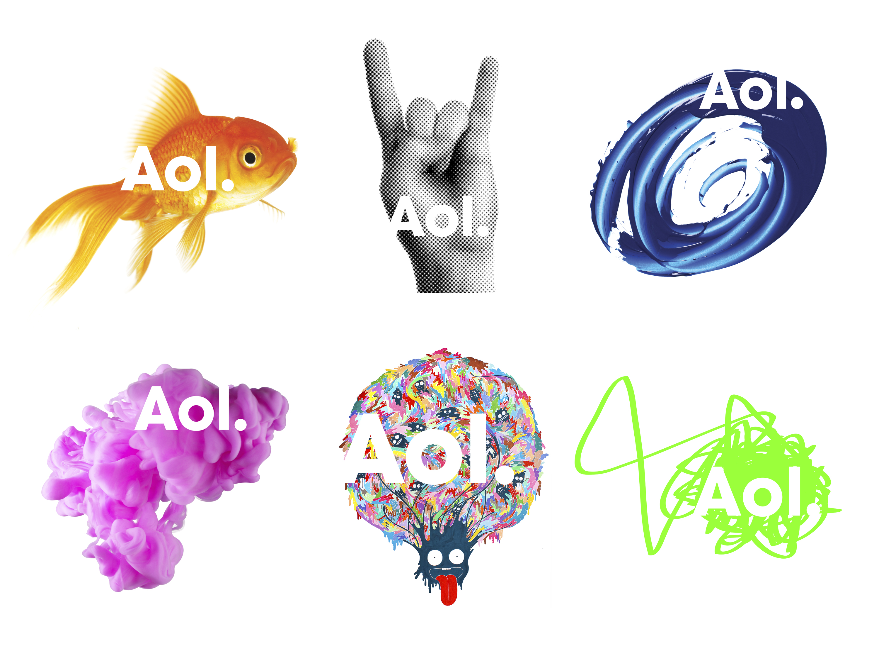
Here are six preview images sent to us by the hard workin’ AOL press team (click for a larger view):
They’ve also released an artsy, abstract video demonstrating the change. What does it all mean?!!??!!
Personally, I love minimalism. I’m quite curious to see how it fits into the rest of the branding, which we’ll have to wait a couple more weeks for.
In the meantime, leave your first impressions in the comments below.
More about:
The Merkle B2B 2023 Superpowers Index outlines what drives competitive advantage within the business culture and subcultures that are critical to success. It is the indispensable guide for B2B marketers to deliver world-class experiences and keep pace with the dynamic environment. Download Now
The ClicData survey found that various challenges exist that prevent organizations from achieving such gains. These challenges included inaccessible data formats and limited flexibility in displaying data in dashboards. Download Now
The need for fraud prevention in the digital world is critical now more than ever. Why? Thinking about your own behavior, consider how you complete transactions and how this has changed over the last 5 years. Download Now
The need for fraud prevention in the digital world is critical now more than ever. Why? Thinking about your own behavior, consider how you complete transactions and how this has changed over the last 5 years. Download Now
Leave a Reply
You must be logged in to post a comment.