Bing Tests New Homepage Layout
Bing's homepage may be getting a new look — and the new layout is a bit reminiscent of Google's current homepage.
Bing's homepage may be getting a new look — and the new layout is a bit reminiscent of Google's current homepage.
Bing’s homepage may be getting a new look — and the new layout is a bit reminiscent of Google’s current homepage.
Rather than having the vertical links to Images, Videos, etc. at left on top of their background picture, in this test Bing has moved those links to the top of the screen and arranged them horizontally (but thankfully doesn’t follow Google’s lead with a “More” pulldown).
“We’re always experimenting with new user experiences. These shots looks like ‘flights’ that we run with small percentages of users to gauge how successful/unsuccessful our ideas are,” said Bing Director Stefan Weitz.
Here are the images (via Microsoft News). Click on any image for a larger version. First, the new layout:

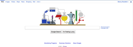
The current Google design for comparative purposes:
And here’s the current Bing design for the majority of users (and what I see on Bing):

Bing is also testing a new header on search results:

And here’s what I currently see for the same image search:

What do you think about these alternative Bing layouts? Better? Worse? Too much like Google? Let us know in the comments.
Leave a Reply
You must be logged in to post a comment.